Hey friend! Ever walk into your bedroom and just feel… blah? Like it’s not quite the cozy sanctuary you dream of? Trust me, I’ve been there! After years of playing with paint swatches and fabric samples, I’ve learned that the right colors can totally transform your sleep space from drab to dreamy.
Choosing the perfect palette can feel overwhelming, but don’t you worry your pretty little head! These absolute best bedroom color combos will help you unlock that serene vibe you’ve been craving. So grab your coffee (or tea!), get comfy, and let’s dive into some seriously inspiring hues that’ll have you snoozing in style.
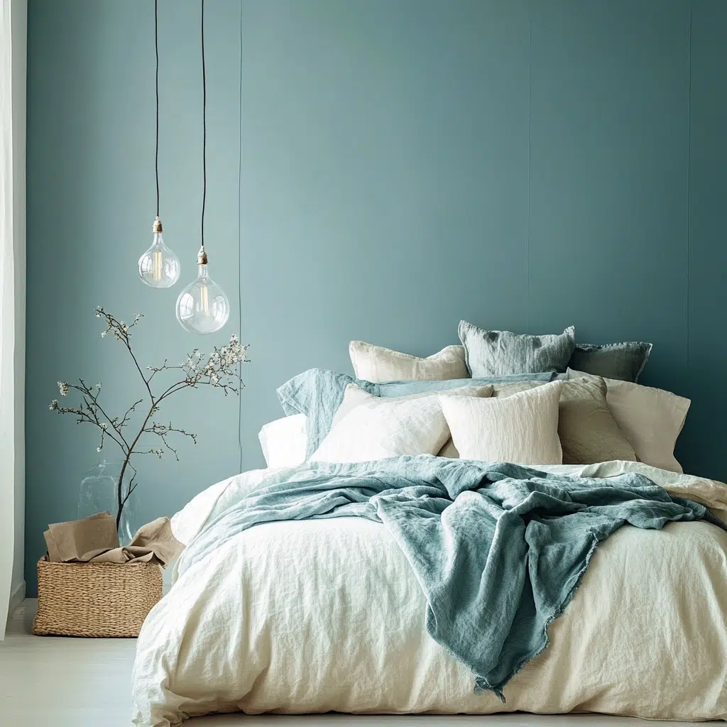
Soft Blue & Sandy Beige
The Inspiration: You know that feeling you get when you’re strolling along a peaceful beach? The gentle rhythm of the waves, the soft, pale blue of the sky meeting the warm, light sand? That’s the magic we’re channeling here. I always find myself drawn to coastal aesthetics because they just whisper relaxation.
Why it works: This combo is a match made in heaven for creating a calming atmosphere. The soft blue is inherently soothing, reminiscent of clear skies and tranquil waters, which can actually help slow your heart rate and ease you into sleep. Pairing it with sandy beige adds warmth and earthiness, preventing the blue from feeling too cool or stark. The subtle contrast is easy on the eyes and creates a harmonious balance, perfect for unwinding after a long day.
Pro Tip: Introduce natural textures like linen or jute in your beige elements (think curtains or a rug) to enhance the coastal feel and add even more warmth and visual interest.
Read More: How to Design a Serene Lavender Bedroom?
Dusty Rose & Warm Gray
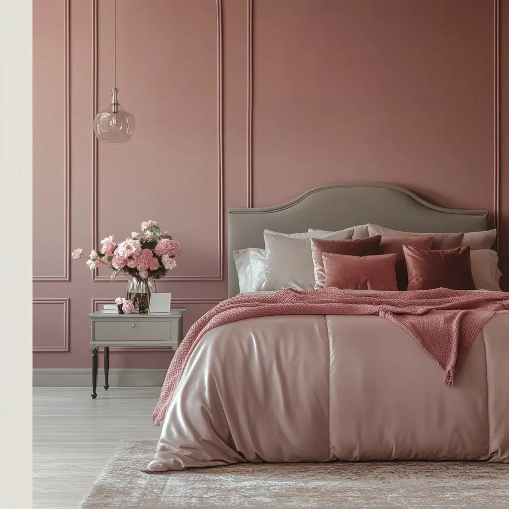
The Inspiration: Sometimes, you just want your bedroom to feel like a sophisticated hug. I was inspired by the soft, muted tones you often see in vintage Parisian apartments – elegant, romantic, and utterly inviting. There’s a certain understated glamour to this pairing that feels both timeless and chic.
Why it works: Dusty rose brings a touch of gentle color and femininity without being overly sweet or childish. It’s a mature, nuanced pink that feels both comforting and stylish. Warm gray acts as the perfect neutral anchor, providing a grounding element that prevents the rose from feeling too overwhelming. The muted tones of both colors create a serene and peaceful environment that’s conducive to rest. Plus, it’s a surprisingly versatile combo that can lean more traditional or contemporary depending on your accessories.
Pro Tip: Incorporate metallic accents like brass or gold in your lighting fixtures or picture frames to elevate the sophistication and add a touch of subtle luxury to this already elegant palette.
Read More: 21 Calming Bedroom Color Schemes for a Relaxed Space
Sage Green & Creamy White
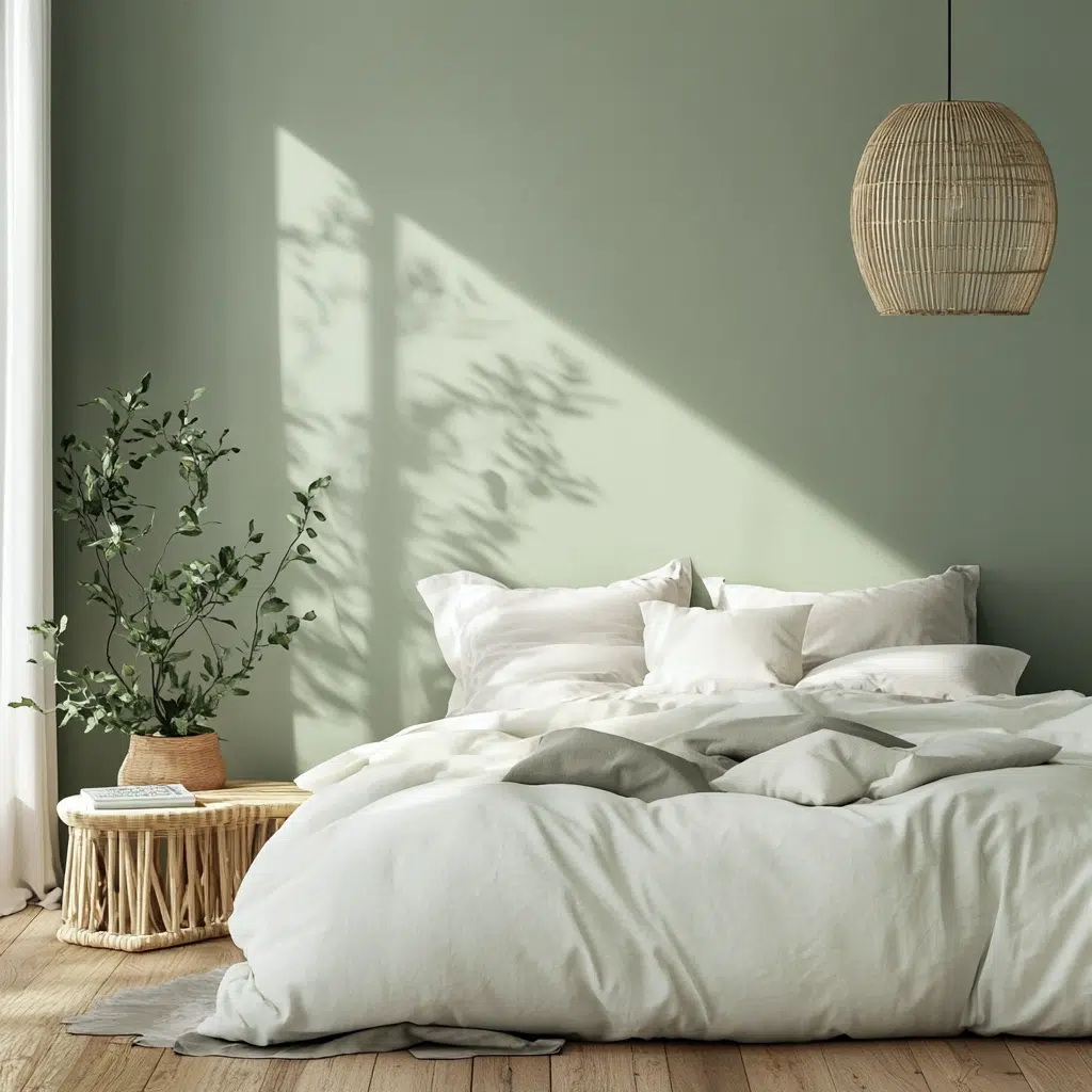
The Inspiration: Ever feel like you need to bring a little bit of the outdoors inside? That’s exactly where this color combo comes from. Think of a peaceful forest clearing, with soft, muted greens and the gentle glow of sunlight filtering through the leaves. It’s all about creating a connection with nature for a sense of calm and rejuvenation.
Why it works: Sage green is a wonderfully tranquil color that’s known for its calming and balancing properties. It’s soft, natural, and incredibly easy on the eyes, making it perfect for a space where you want to unwind. Pairing it with creamy white adds a touch of freshness and airiness, preventing the green from feeling too heavy or dark. This combination feels clean, serene, and effortlessly stylish, creating a bedroom that feels like a breath of fresh air.
Pro Tip: Bring in actual greenery with potted plants to enhance the natural vibe and add even more visual interest and a touch of life to your sage green and creamy white sanctuary.
Read More: 17 Creative Ideas for Above-Bed Decor
Lavender & Pale Yellow
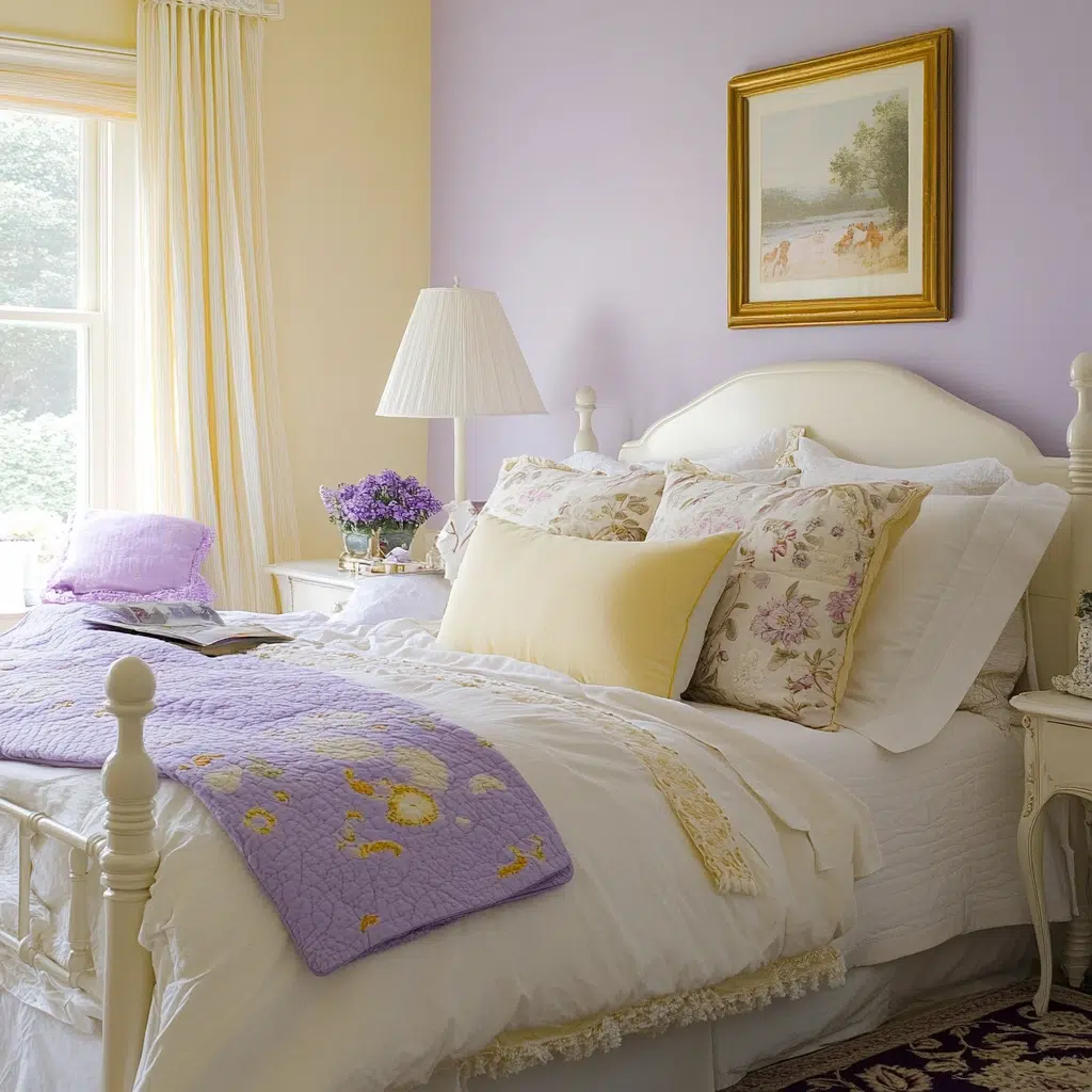
The Inspiration: Sometimes, you want a bedroom that feels both cheerful and soothing, right? This combo was inspired by a field of blooming lavender under a soft, sunny sky. It’s about capturing that feeling of gentle happiness and tranquility all at once.
Why it works: Lavender is well-known for its calming and stress-reducing properties, making it an ideal choice for a bedroom. Its soft, slightly cool tone creates a sense of peace and relaxation. Pale yellow adds a touch of gentle warmth and optimism without being too bright or overwhelming. The subtle contrast between the cool lavender and the warm yellow creates a balanced and inviting atmosphere that feels both playful and serene.
Pro Tip: Use different shades and textures of lavender and yellow to add depth and visual interest. Think a chunky knit lavender throw or patterned pale yellow cushions.
Read More: 21 Hotel Vibe Bedroom Ideas for a Luxurious Sleep
Charcoal Gray & Mustard Yellow
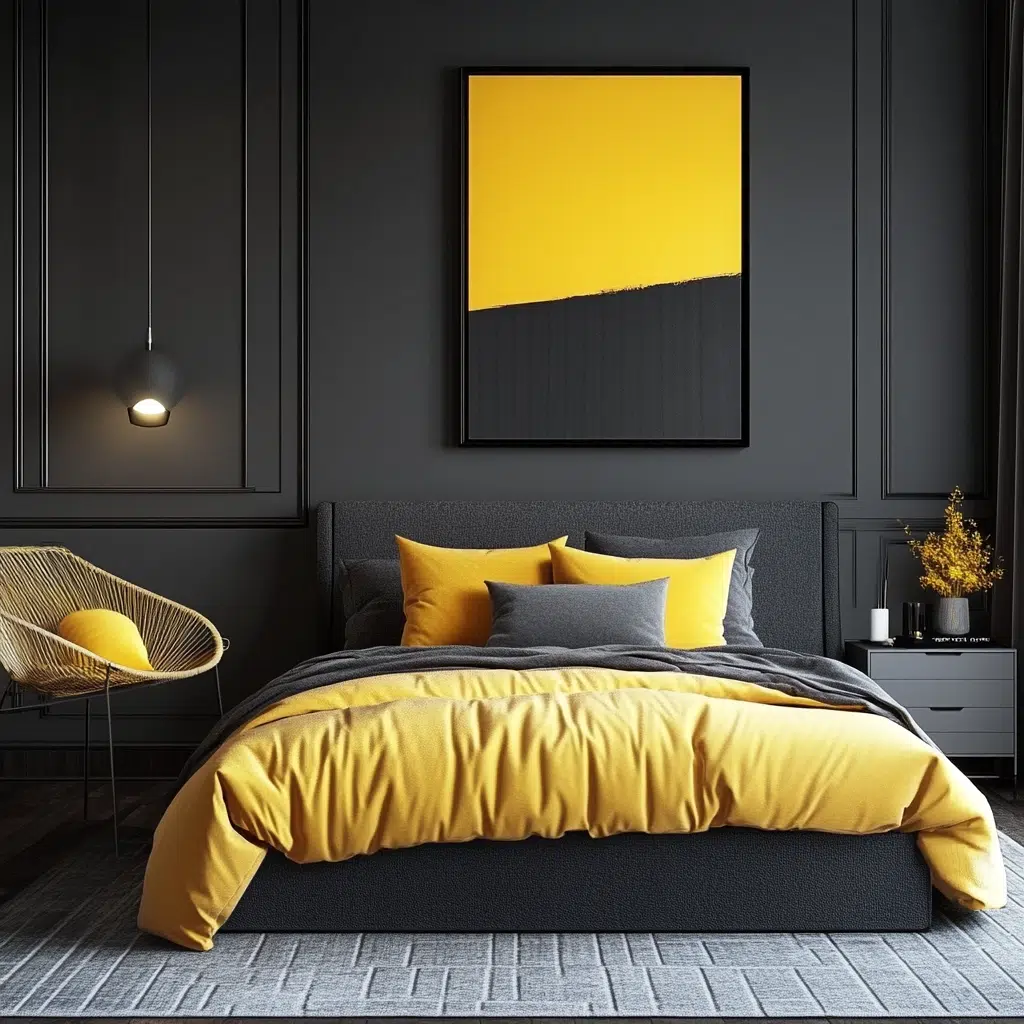
The Inspiration: For those who love a bit of modern drama with a pop of personality, this is your go-to. I was inspired by sleek, contemporary city apartments that aren’t afraid to make a statement. It’s about blending sophistication with a touch of unexpected vibrancy.
Why it works: Charcoal gray provides a strong, grounding neutral that feels sophisticated and modern. It’s a bold choice that creates a sense of depth and drama. Mustard yellow injects energy and warmth, acting as a vibrant accent that prevents the gray from feeling too somber. This high-contrast combination is visually striking and stylish, perfect for those who want a bedroom with a bit of an edge while still feeling cozy.
Pro Tip: Use mustard yellow sparingly in accent pieces like throw pillows, artwork, or a small bedside lamp to let it really pop against the charcoal gray backdrop.
Read More: 17 Totally Awesome 70s Bedroom Decor Ideas
Terracotta & Olive Green
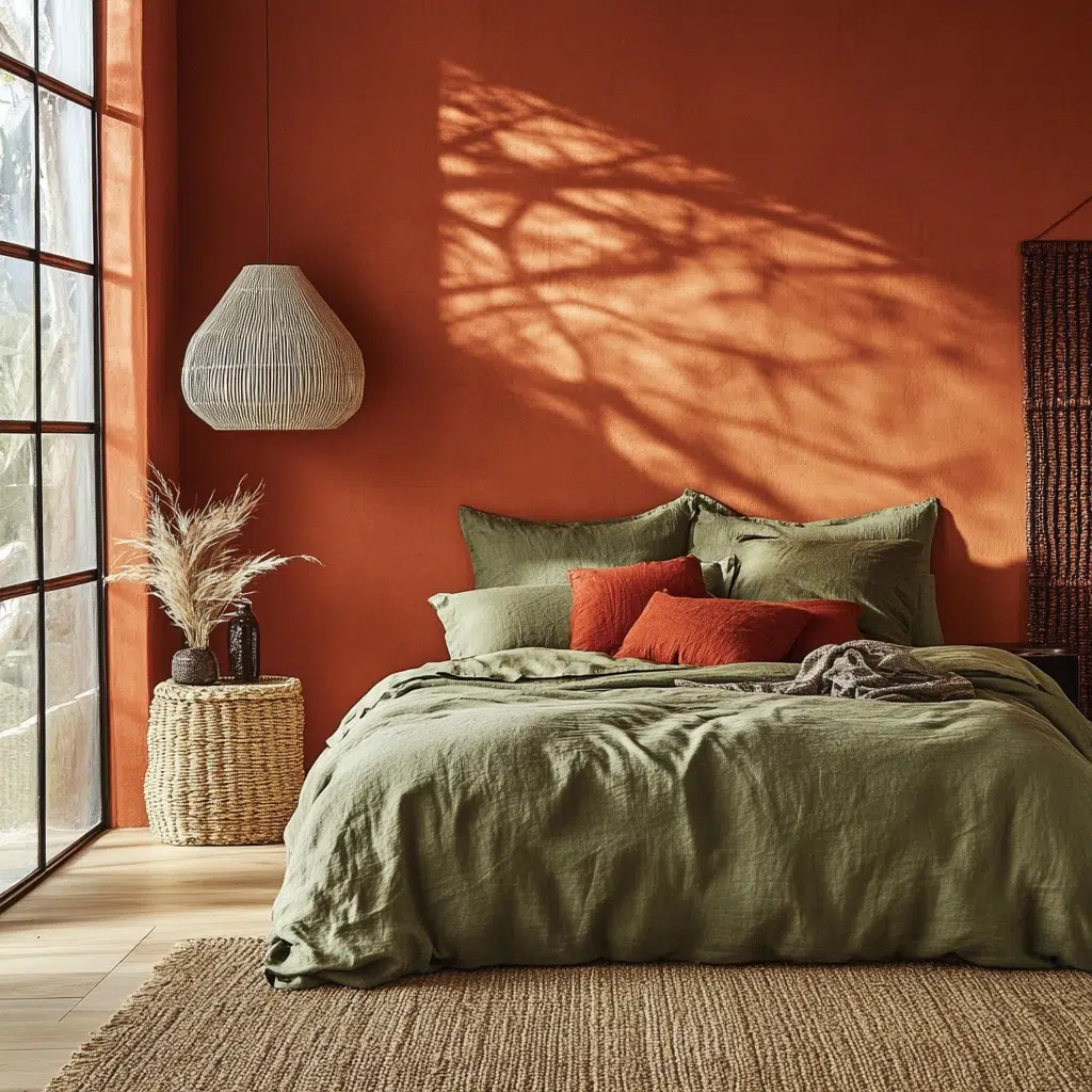
The Inspiration: Imagine a sun-drenched Tuscan villa, with its warm, earthy tones and lush greenery. That’s the vibe we’re aiming for with this combo. It’s all about creating a space that feels grounded, warm, and connected to the earth.
Why it works: Terracotta brings a rich, warm, and inviting feel with its earthy, reddish-brown tones. It adds a sense of natural comfort and rustic charm. Olive green complements it beautifully with its muted, sophisticated green hues that evoke nature and tranquility. Together, these colors create a bedroom that feels both cozy and sophisticated, like a peaceful retreat in the countryside.
Pro Tip: Incorporate natural materials like wood and leather to enhance the earthy feel of this color combination. Think a wooden headboard or a leather armchair.
Read More: 17 Aesthetic Vintage-Inspired Bedroom Design Ideas
Navy Blue & Crisp White
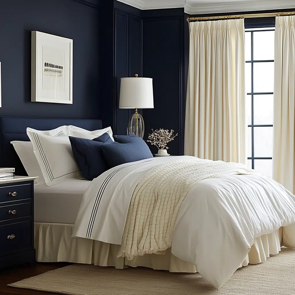
The Inspiration: This is a classic for a reason! Think of a breezy sailboat against a clear blue sky – timeless, clean, and always stylish. It’s a pairing that evokes a sense of calm and sophistication without ever feeling dated.
Why it works: Navy blue is a deeply calming and sophisticated color that promotes relaxation and a sense of stability. Crisp white provides a clean, fresh contrast that brightens the space and prevents the navy from feeling too heavy. This high-contrast combination is visually appealing and creates a bedroom that feels both serene and polished. It’s a versatile palette that can be dressed up or down with different textures and accessories.
Pro Tip: Introduce nautical-inspired elements like rope details or striped patterns in your accessories to subtly enhance the classic maritime feel of this color scheme.
Read More: Blue and Cream Bedroom Ideas for a Serene Space
Peach & Light Teal
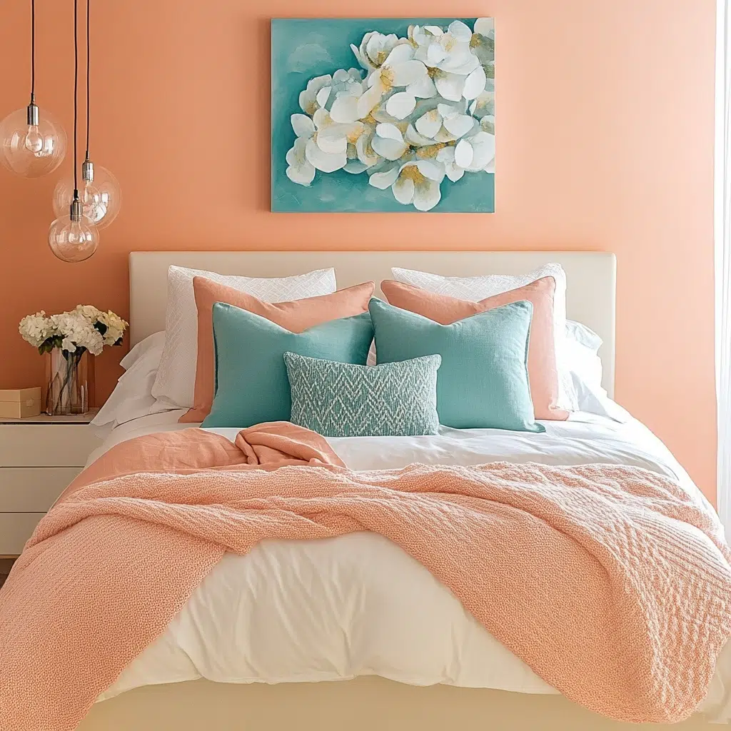
The Inspiration: Sometimes you want a bedroom that feels like a refreshing tropical escape, right? This combo was inspired by the vibrant yet calming hues of a sunset over a turquoise sea. It’s about bringing a touch of playful energy into your relaxing space.
Why it works: Peach brings a warm, cheerful, and inviting energy to the room. It’s a soft, optimistic hue that feels welcoming and comforting. Light teal offers a cool, refreshing contrast that balances the warmth of the peach and adds a touch of vibrancy without being overwhelming. These complementary colors create a harmonious and balanced feel that’s both lively and serene.
Pro Tip: Use varying shades of peach and teal to add depth and visual interest. Think a soft peach on the walls with bolder teal accents in your throw pillows and artwork.
Read More: 17 Genius Small Bedroom Inspiration (Tiny Tips for a Big Impact)
Forest Green & Taupe
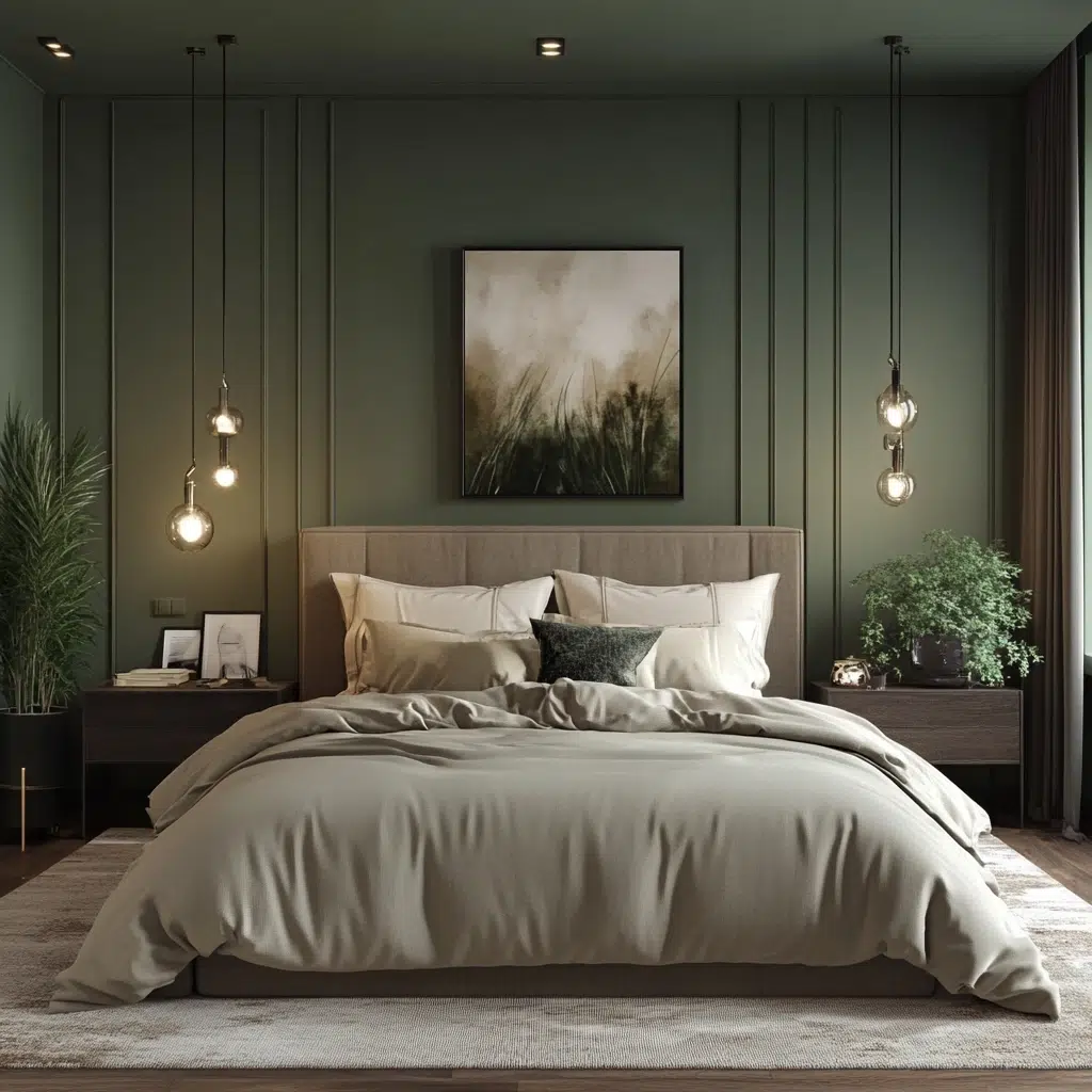
The Inspiration: Imagine being surrounded by the quiet beauty of a deep forest. That’s the feeling this color combination aims to capture. It’s about creating a space that feels grounded, sophisticated, and deeply connected to nature in a more dramatic way than sage and white.
Why it works: Forest green is a rich, deep, and calming color that evokes a sense of tranquility and connection to the natural world. Taupe, a warm and versatile neutral, provides a sophisticated backdrop that allows the green to really shine without feeling overwhelming. This combination feels both luxurious and grounding, creating a bedroom that’s a true retreat.
Pro Tip: Incorporate natural wood tones and textures like a woven rug or a live-edge wood nightstand to enhance the organic and sophisticated feel of this palette.
Read More: 21 Genius Walk-in Closet Corner Ideas for the Smallest Bedrooms
Blush Pink & Gold
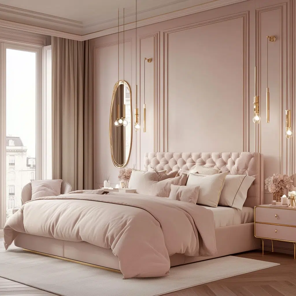
The Inspiration: For those who love a touch of glamour and romance, this pairing is pure magic. Think of a luxurious boudoir with soft, delicate pinks accented by shimmering gold details. It’s all about creating a space that feels feminine, elegant, and a little bit indulgent.
Why it works: Blush pink is a soft, delicate, and inherently romantic color that creates a feeling of warmth and comfort. Gold accents add a touch of luxury, sophistication, and visual interest, elevating the softness of the pink. This combination feels both glamorous and inviting, perfect for creating a bedroom that’s a true sanctuary of style and comfort.
Pro Tip: Use gold sparingly in your lighting fixtures, mirrors, or decorative accessories to make a statement without overwhelming the soft blush tones.
Read More: 17 Cute Master Bedroom Closet Ideas
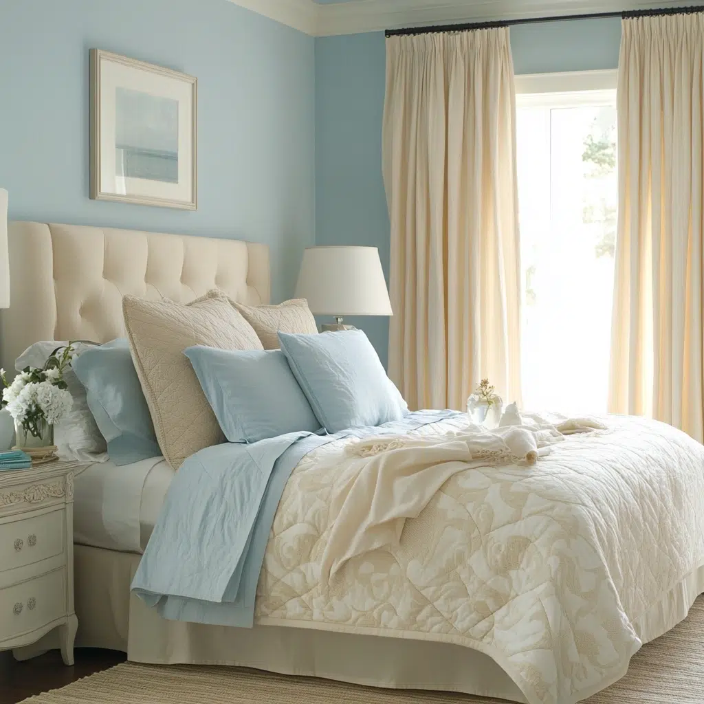
Sky Blue & Linen White
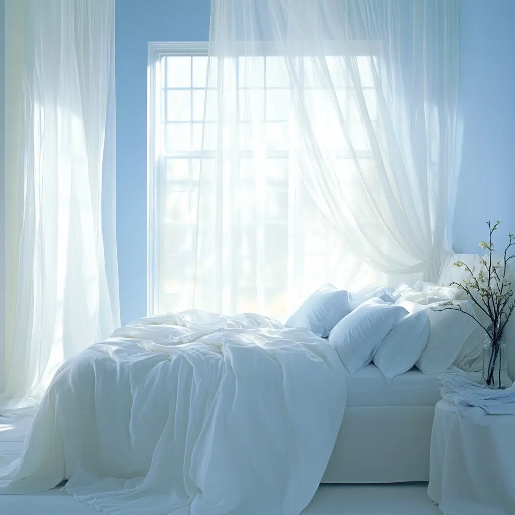
The Inspiration: This combo is all about creating a light, airy, and utterly peaceful atmosphere. Think of a bright, sunny day with a clear blue sky and soft, white clouds. It’s about capturing that feeling of openness and tranquility in your bedroom.
Why it works: Sky blue is a light, refreshing, and inherently calming color that promotes relaxation and a sense of spaciousness. Linen white, with its subtle warmth and texture, adds depth and prevents the white from feeling too stark or clinical. This combination feels clean, serene, and effortlessly inviting, perfect for creating a bedroom that feels like a breath of fresh air.
Pro Tip: Incorporate natural linen fabrics in your bedding or curtains to enhance the light and airy feel and add a touch of subtle texture.
Read More: 17 Dreamy Aesthetic Bedroom Ideas
Mint Green & Soft Gray
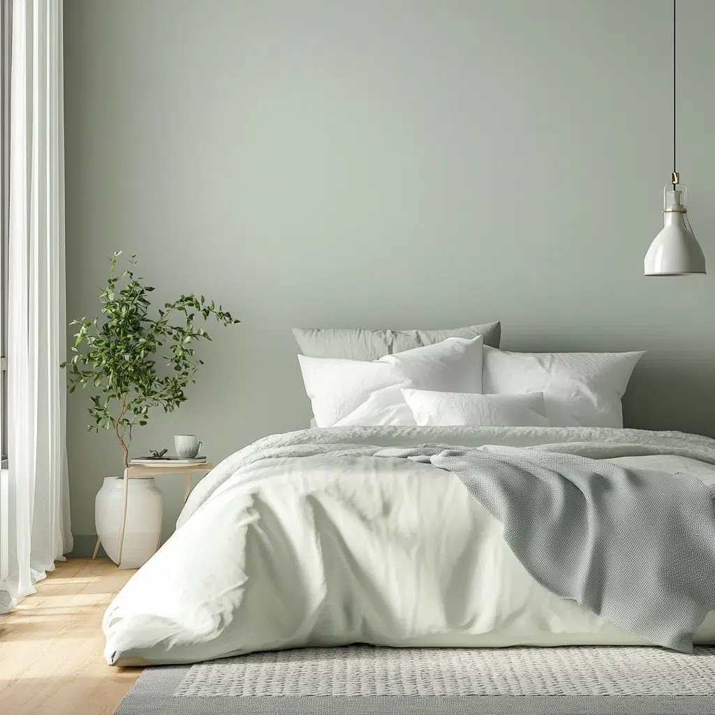
The Inspiration: Looking for a bedroom that feels both refreshing and calming? This combo was inspired by the cool, crisp feeling of a spring morning. It’s about creating a space that feels clean, serene, and subtly invigorating.
Why it works: Mint green is a light, airy, and refreshing color that has a calming effect. It’s gentle on the eyes and promotes a sense of tranquility. Soft gray provides a neutral and sophisticated backdrop that allows the mint green to shine without being overwhelming. This combination feels clean, soothing, and effortlessly stylish, perfect for creating a bedroom that’s a peaceful retreat.
Pro Tip: Introduce subtle patterns in your mint green or gray elements, like a geometric print in your throw pillows, to add a touch of visual interest without disrupting the calm vibe.
Read More: 21 Modern Neutral Bedroom Ideas for Ultimate Serenity
Deep Plum & Silver
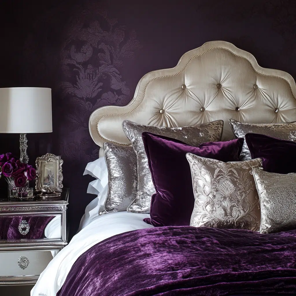
The Inspiration: If you’re craving a bedroom that feels rich, luxurious, and a little bit dramatic, this is your power pairing. Think of a jewel-toned velvet curtain catching the moonlight. It’s all about creating a space that feels opulent and sophisticated.
Why it works: Deep plum is a rich, moody, and luxurious color that adds a sense of depth and drama to a space. Silver accents provide a touch of glamour, sophistication, and visual contrast, elevating the richness of the plum. This combination feels both opulent and inviting, perfect for creating a bedroom that’s a true statement of style and comfort.
Pro Tip: Use silver in your lighting fixtures, picture frames, or decorative accessories to add a touch of sparkle and enhance the luxurious feel of the deep plum.
Read More: 17 Totally Awesome 90s Bedroom Decor Ideas
Burnt Orange & Deep Brown
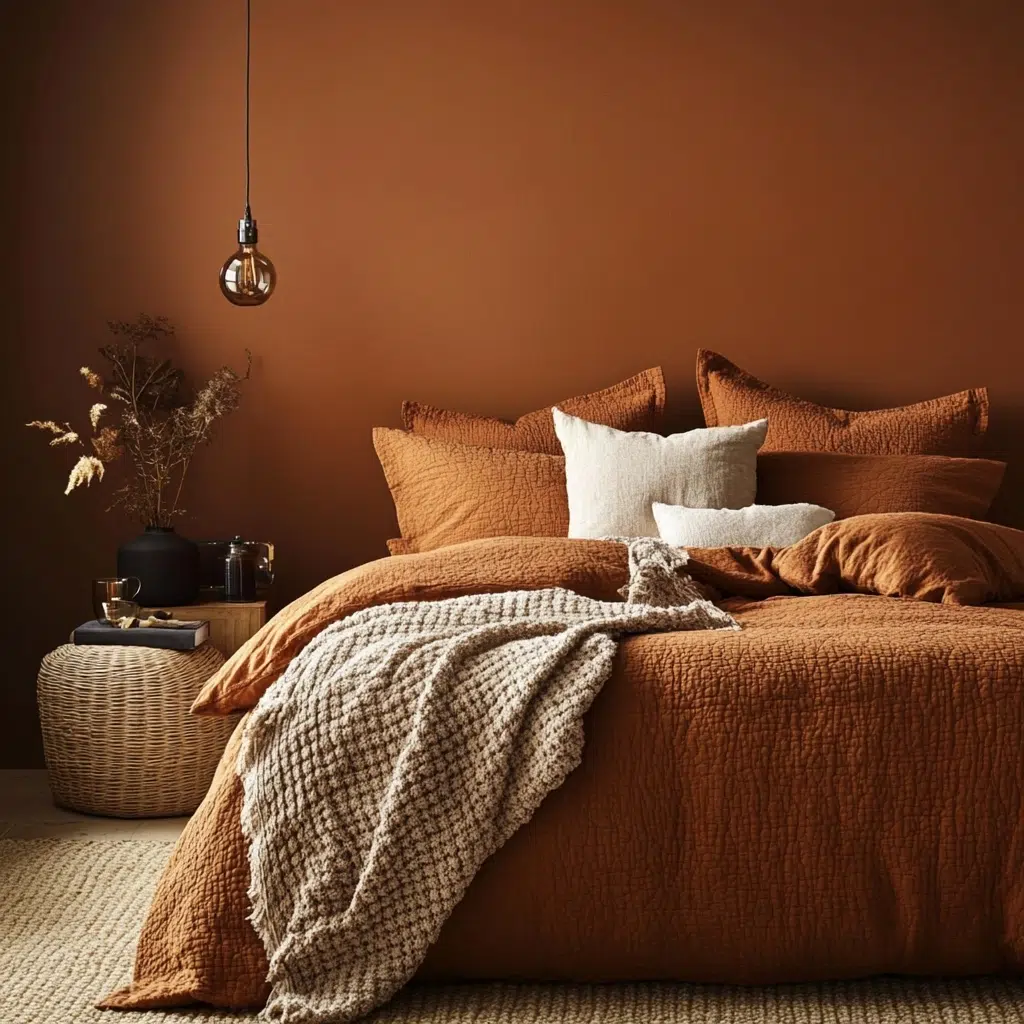
The Inspiration: Craving a bedroom that feels warm, cozy, and inviting, like a crackling fireplace on a chilly evening? This combo was inspired by the rich, earthy tones of autumn. It’s all about creating a space that feels comforting and grounded.
Why it works: Burnt orange brings a warm, earthy, and inviting energy to the room. It’s a comforting hue that feels both grounded and vibrant. Deep brown provides a rich, solid anchor that enhances the warmth of the orange and adds a sense of depth and coziness. This combination feels inherently welcoming and creates a bedroom that’s a true haven of comfort.
Pro Tip: Incorporate tactile textures like chunky knit blankets or faux fur throws in these warm tones to enhance the cozy and inviting atmosphere.
Read More: 17 Colorful Bedroom Ideas (Bedroom With Vibrant Colors)
Teal & Coral
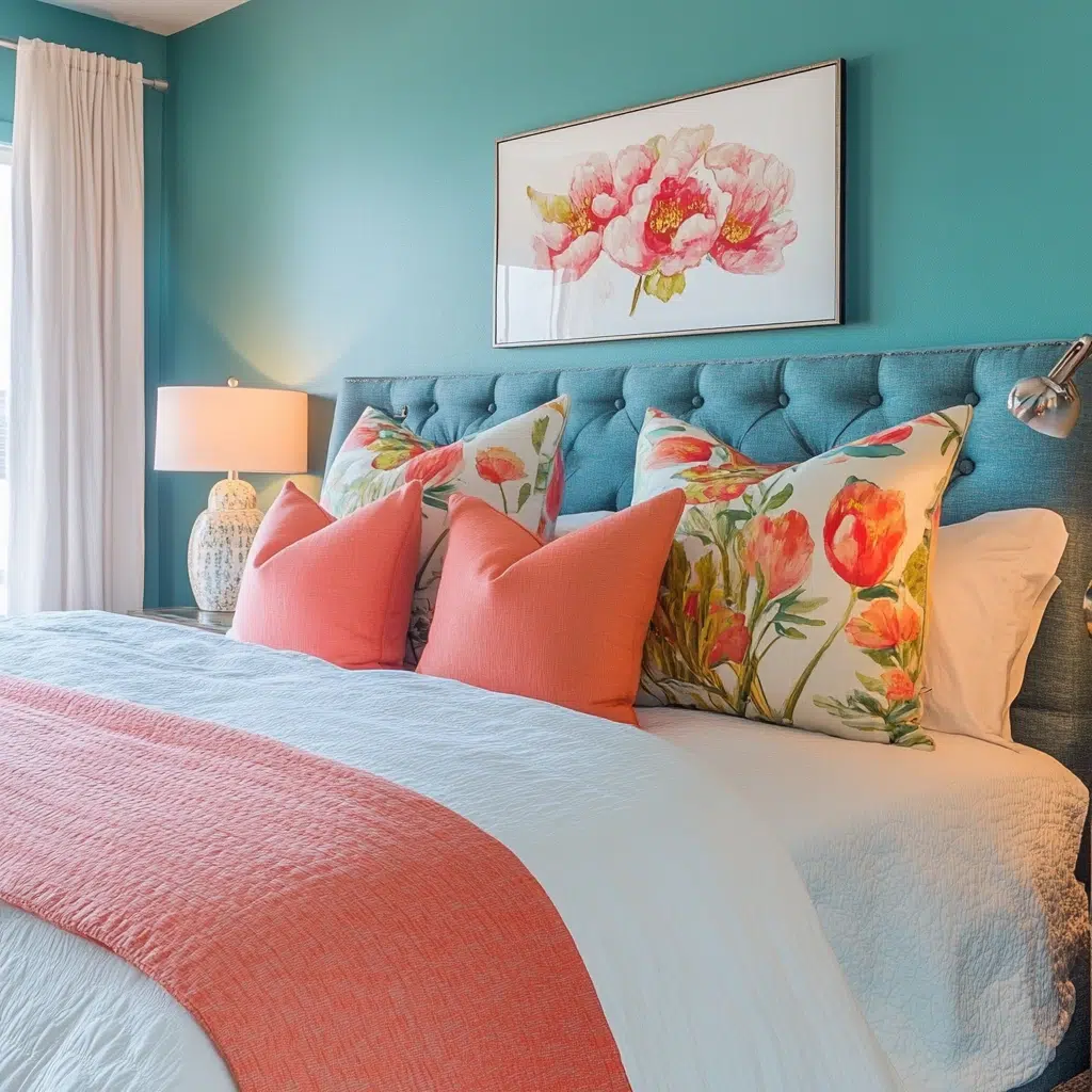
The Inspiration: Looking for a bedroom that feels vibrant and energetic yet still balanced and calming? This combo was inspired by the beautiful contrast of a tropical reef, with its lively corals against the deep turquoise waters. It’s about bringing a touch of dynamic harmony into your sleep space.
Why it works: Teal is a beautiful blend of blue and green, offering a sense of both calm and invigoration. Coral, a warm and vibrant hue, provides a lively contrast that adds energy and personality. These complementary colors create a balanced and harmonious feel that’s both visually exciting and surprisingly serene.
Pro Tip: Use teal as the dominant color on the walls and introduce coral in smaller doses through accent pieces like throw pillows, artwork, or a statement rug to create a balanced look.
Read More: 17 Stylish Bedroom Ideas with Earthy Tones
Pale Gray & Sunshine Yellow
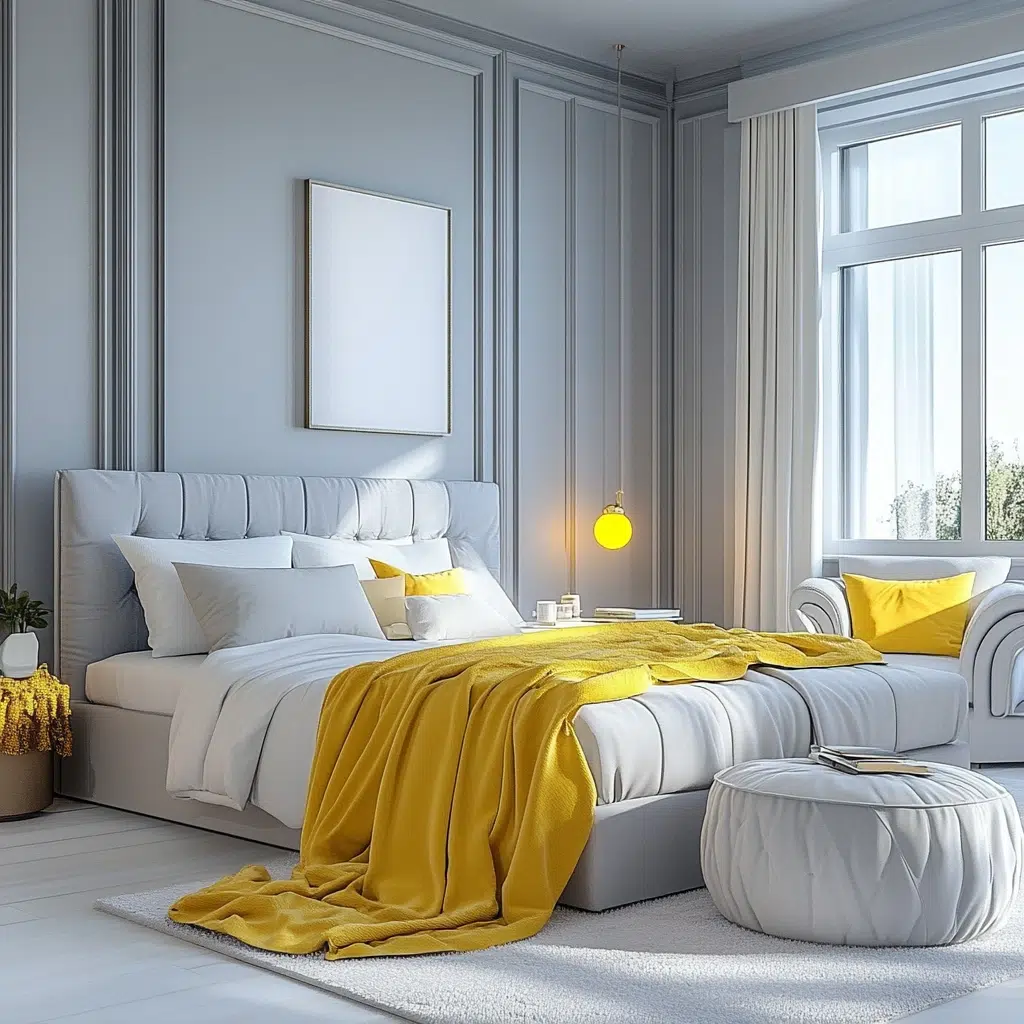
The Inspiration: Sometimes you want a bedroom that feels sophisticated and calm but still has a touch of cheerful brightness. This combo was inspired by a cloudy day suddenly brightened by a burst of sunshine. It’s about creating a space that’s both serene and uplifting.
Why it works: Pale gray provides a sophisticated and versatile neutral backdrop that feels calm and grounding. Sunshine yellow injects a dose of cheerful energy and optimism without being overwhelming. This combination offers the best of both worlds – a serene base with a happy pop of color that can instantly lift your mood.
Pro Tip: Use sunshine yellow in smaller, impactful ways, like a bright throw blanket at the end of the bed or vibrant artwork, to let it really shine against the pale gray.
Emerald Green & White
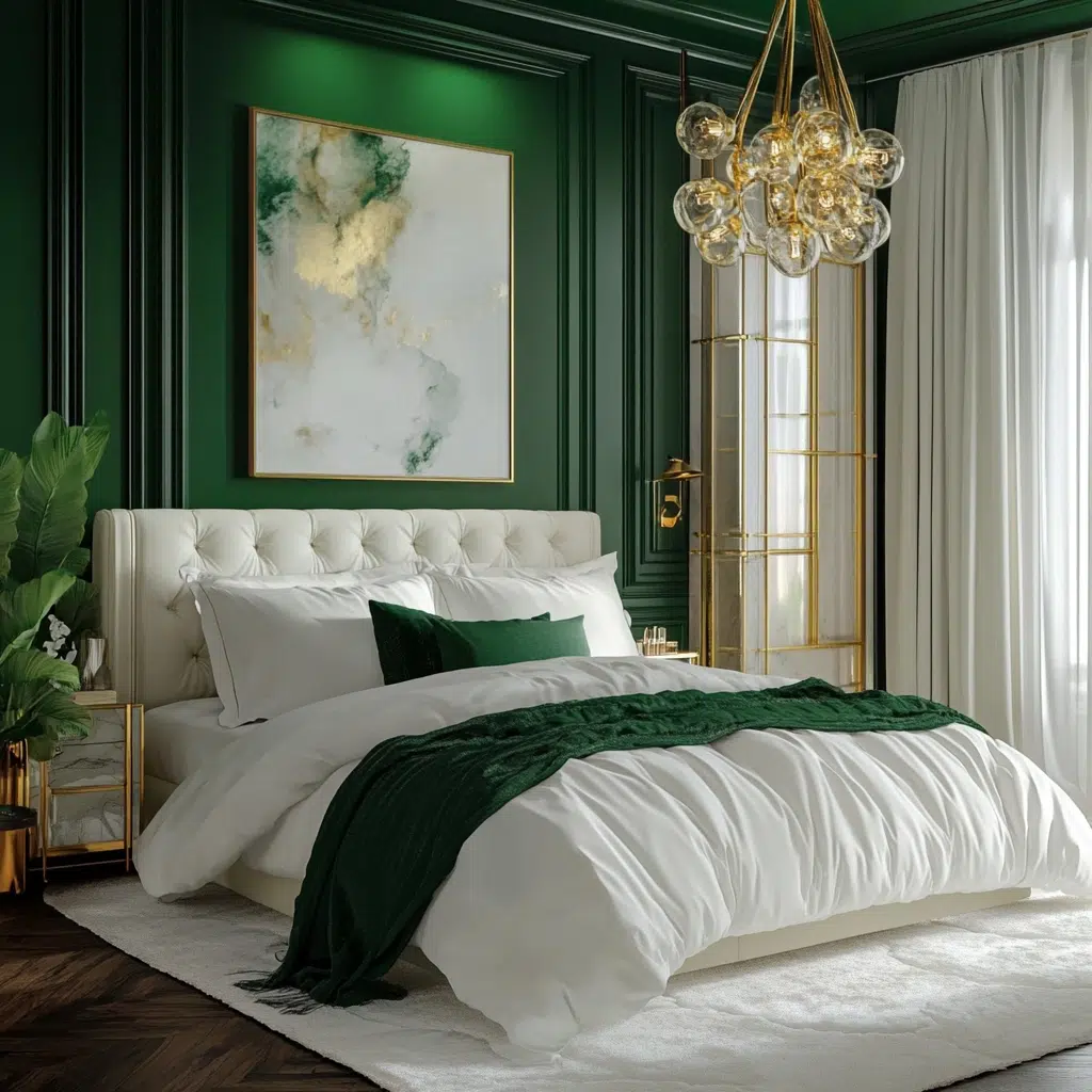
The Inspiration: For a bedroom that feels fresh, luxurious, and a little bit dramatic, this pairing is a winner. Think of lush green foliage against a crisp white wall. It’s about creating a space that feels both vibrant and clean.
Why it works: Emerald green is a rich, vibrant, and sophisticated color that brings a sense of freshness and luxury to a room. Crisp white provides a clean and bright contrast that enhances the richness of the green and makes the space feel open and airy. This combination is visually striking and creates a bedroom that feels both invigorating and serene.
Pro Tip: Incorporate metallic accents like gold or brass to enhance the luxurious feel of the emerald green and white palette. Think a gold-framed mirror or brass bedside lamps.
Mustard & Teal
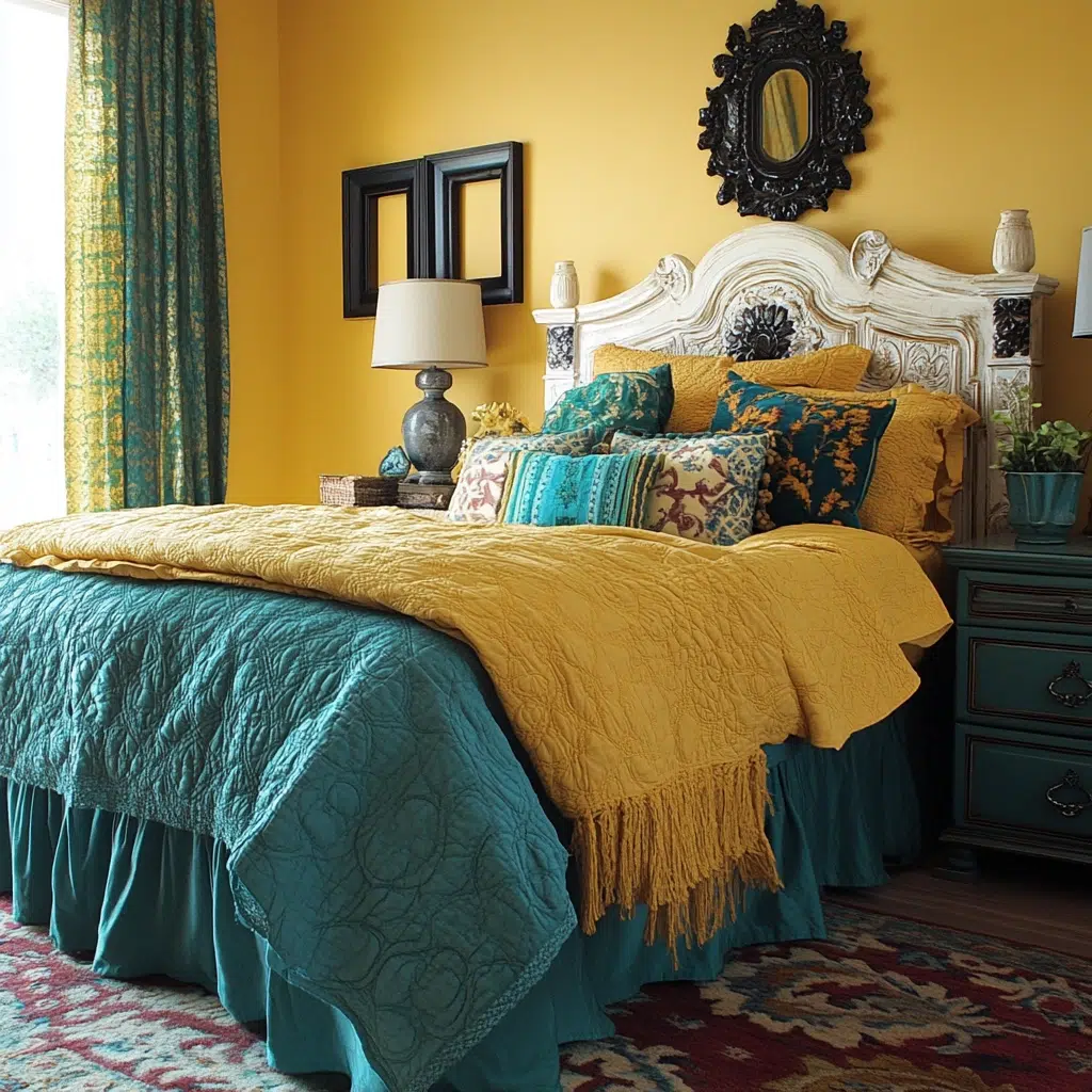
The Inspiration: Looking for a bedroom with a bit of a bold and stylish vintage vibe? This combo was inspired by the rich, earthy tones and interesting color pairings often seen in mid-century modern design. It’s about creating a space with personality and a touch of retro flair.
Why it works: Mustard yellow is a warm, earthy, and stylish color that adds a touch of vintage charm and personality. Teal, with its blend of blue and green, provides a cool and contrasting element that balances the warmth of the mustard and adds a sense of sophistication. This unexpected combination is visually interesting and creates a bedroom that feels both unique and inviting.
Pro Tip: Look for furniture and accessories with clean lines and vintage-inspired details to enhance the mid-century modern feel of this color scheme.
Copper & Cream
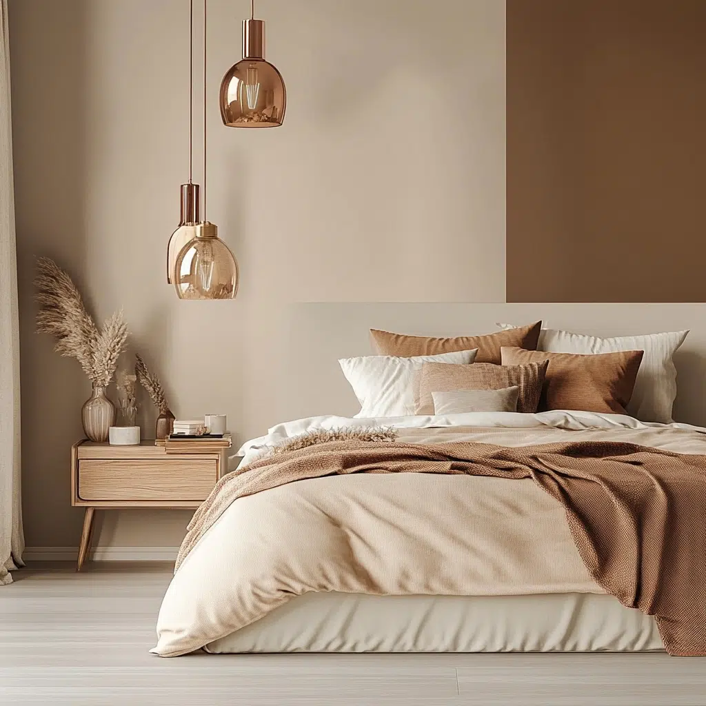
The Inspiration: If you’re drawn to a bedroom that feels warm, inviting, and has a touch of industrial chic, this is a fantastic pairing. Think of the warm glow of copper accents against a soft, creamy backdrop. It’s about creating a space that feels both cozy and stylishly modern.
Why it works: Cream provides a soft, warm, and versatile neutral backdrop that feels inviting and comfortable. Copper accents add warmth, visual interest, and a touch of industrial elegance. The metallic sheen of the copper catches the light and adds depth and texture to the otherwise soft palette. This combination feels both grounded and sophisticated.
Pro Tip: Incorporate raw or natural materials like wood and linen alongside the copper and cream to enhance the warm and slightly industrial feel of the space.
Black & White (with a pop of color)
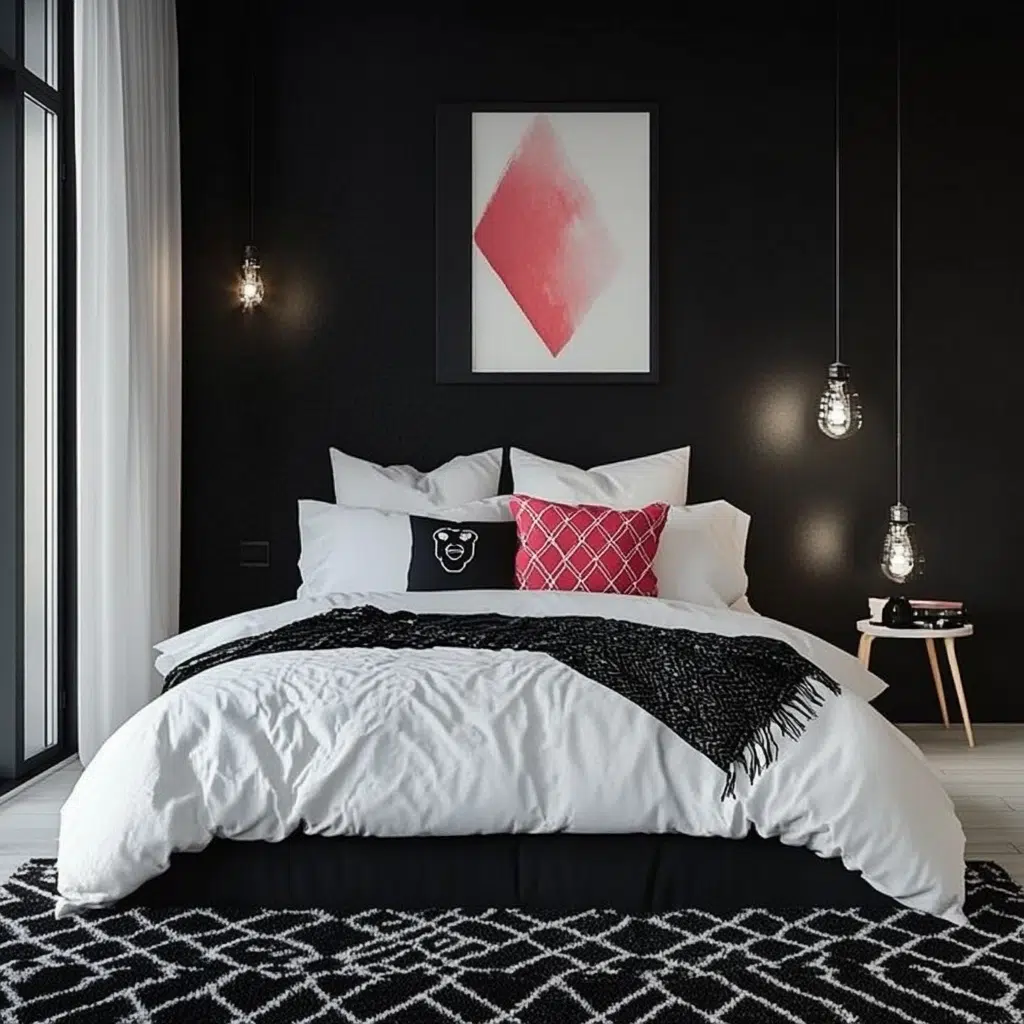
The Inspiration: Sometimes you want a bedroom that’s a dramatic and versatile canvas, right? This combo is inspired by classic, minimalist design with the opportunity to inject your own personality through a single, impactful accent color.
Why it works: Black and white create a bold, graphic, and timeless backdrop that can be incredibly chic and sophisticated. The high contrast is visually striking and provides a strong foundation. Introducing a single vibrant pop of color, whether it’s a sunny yellow, a bold teal, or a rich jewel tone, allows you to personalize the space and add energy and interest without overwhelming the clean aesthetic.
Pro Tip: Choose your pop of color carefully to reflect your personality and the mood you want to create. Consider changing the accent color seasonally for a quick and easy refresh!
Monochromatic Blues (various shades)
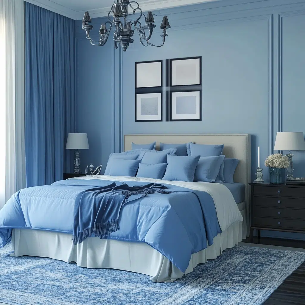
The Inspiration: For a bedroom that feels utterly serene and sophisticated, a monochromatic scheme is often the way to go. This idea focuses on the calming and versatile nature of blue, layering different shades to create depth and visual interest. Think of the subtle variations in the ocean’s hues.
Why it works: Using different shades of the same color creates a harmonious and cohesive look that’s incredibly calming and easy on the eyes. Layering light, medium, and dark blues adds dimension and prevents the space from feeling flat or boring. This approach allows you to create a sophisticated and tranquil atmosphere that promotes relaxation and restful sleep.
Pro Tip: Incorporate different textures within your blue palette, like a velvet throw, a linen duvet cover, and a chunky knit pillow, to add tactile interest and prevent the monochromatic scheme from feeling one-dimensional.
Final Thoughts
So there you have it, friend! These gorgeous color combinations will spark your bedroom makeover dreams. Remember, the most important thing is to choose colors that make you feel happy and relaxed. These are just starting points – feel free to tweak them, play with textures, and add your own personal touches to create a space that truly feels like your own serene sanctuary. Now go forth and paint your way to a better night’s sleep! You got this!