Picture this: you’re standing in your living room, paint samples scattered everywhere, completely overwhelmed by the sheer number of choices. Sound familiar? Choosing the right wall color combination can transform your space from “meh” to magnificent, but it doesn’t have to be stressful.
Whether you’re craving something bold and dramatic or soft and serene, the right pairing can completely change how a room feels. These 21 stunning combinations will help you find your perfect match – no design degree required.
1. Navy Blue and Crisp White

Classic Contrast: Navy blue paired with crisp white creates a timeless look that never goes out of style. The navy adds richness and drama to your space, while the white keeps everything feeling fresh and prevents the room from looking too dark. This combination works beautifully in bedrooms, living rooms, and even bathrooms where you want that coastal-meets-sophisticated vibe.
Where It Works Best: This pairing shines in spaces with good natural light because the white amplifies brightness while the navy grounds the room. Use it in open-plan areas to create visual interest without chopping up the flow. The contrast is strong enough to make a statement but refined enough to work with almost any furniture style.
Product Spotlight: The Purdy White Dove 3-Inch Flat Sash Paint Brush gives you professional-quality results when cutting in those crisp white edges against your navy walls. This brush holds paint beautifully and creates clean lines without constant reloading, making your painting project faster and less frustrating. The angled bristles are perfect for getting into corners and along trim work where precision matters most.
Read More: 21 Inspiring Front Walkway Ideas
2. Sage Green and Warm Cream

Nature’s Embrace: Sage green brings the outdoors inside with its calming, earthy tone, pairing perfectly with warm cream. This combination creates a serene atmosphere that feels both fresh and cozy. The sage doesn’t overpower the space, while the cream adds warmth and prevents the green from feeling too cool or clinical.
Versatility Factor: This duo works wonders in bedrooms to promote relaxation, but it’s equally stunning in kitchens and dining areas. The warm cream can be your base color with sage as an accent, or flip it depending on how bold you’re feeling. Either way, you’ll end up with a space that feels grounded and inviting.
Product Spotlight: The FrogTape Multi-Surface Painting Tape is essential for achieving those perfect lines between your sage and cream sections. This tape uses PaintBlock Technology to seal the edges and prevent paint bleed, giving you professional-looking results even if this is your first time painting. It removes cleanly without damaging your fresh paint or leaving sticky residue behind.
Read More: 21 Incredible Coffee Table Arrangement Ideas
3. Charcoal Gray and Blush Pink
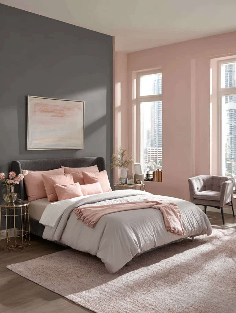
Modern Romance: Charcoal gray might seem serious, but pair it with blush pink and suddenly you’ve got a sophisticated, modern combination that’s anything but boring. The gray provides a strong foundation, making the pink feel grown-up rather than childish. This pairing works especially well in spaces where you want a contemporary feel with a soft, feminine touch.
Balance is Everything: The key here is getting your proportions right – too much pink can feel overwhelming, while too much gray might seem cold. Try charcoal on one accent wall with blush on the remaining walls, or use charcoal as your main color with pink as strategic accents. The gray keeps things grounded while the pink adds just enough warmth and personality.
Product Spotlight: The Wooster Brush Shortcut Polyester Angle Sash Paintbrush makes blending these two colors seamless, especially around corners and edges. The polyester bristles work beautifully with both latex and oil-based paints, maintaining their shape throughout your project. You’ll appreciate the comfortable grip during those longer painting sessions when you’re working on multiple walls.
Read More: 21 Insanely Trendy Narrow Laundry Room Ideas
4. Terracotta and Ivory
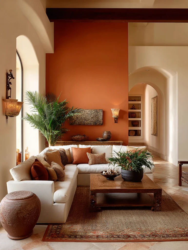
Warm and Welcoming: Terracotta brings that sun-baked, Mediterranean warmth that instantly makes a space feel cozy and inviting. Paired with ivory, it creates an earthy yet light combination. The ivory lightens the intensity of terracotta while still maintaining that warm, enveloping feeling you’re after.
Perfect Placement: This combination absolutely shines in living rooms and dining areas where you entertain and want people to feel comfortable. Terracotta works beautifully as an accent wall behind a sofa or dining table, with ivory on the surrounding walls. The warmth of both colors creates an atmosphere that encourages conversation and lingering over meals.
Product Spotlight: The Wagner Spraytech HomeRight Quick Painter Pad Edger helps you tackle larger wall sections quickly when working with these warm tones. The paint pad holds more paint than traditional rollers, reducing the number of times you need to reload. It’s especially useful for getting smooth, even coverage with terracotta, which can sometimes show streaks with regular rollers.
Read More: Amazing Chic Book Shelf Ideas for an Aesthetic Vibe
5. Forest Green and Golden Yellow
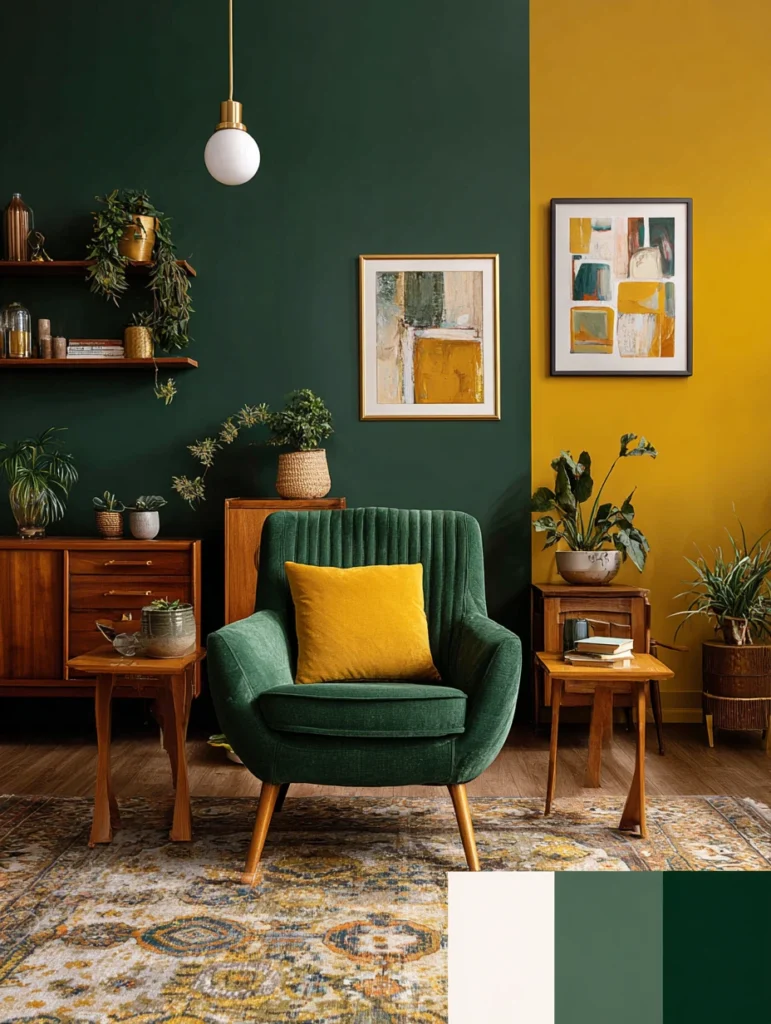
Bold and Bright: Forest green paired with golden yellow creates a cheerful combination that’s not childish. The deep green provides richness and depth, while the golden yellow adds energy and optimism. This pairing feels both sophisticated and playful, making it perfect for spaces where you want to inject personality.
Creating Balance: Use forest green as your dominant color to anchor the room, then introduce golden yellow through accent walls or architectural details like built-ins or alcoves. The green prevents the yellow from feeling too intense, while the yellow keeps the green from seeming too dark. Together, they create a dynamic that’s energizing without being overwhelming.
Product Spotlight: The 3M Hand-Masker Masking Film and Tape Dispenser becomes your best friend when you’re working with two distinct colors like this. It dispenses both masking tape and plastic film simultaneously, protecting floors, furniture, and one color from another. This tool cuts your prep time in half and ensures clean color separation.
Read More: 17 Smart Small Laundry Closet Ideas (Tiny Space Hacks)
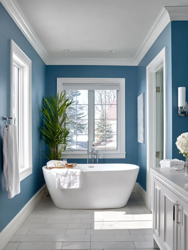
6. Dusty Blue and Warm Taupe
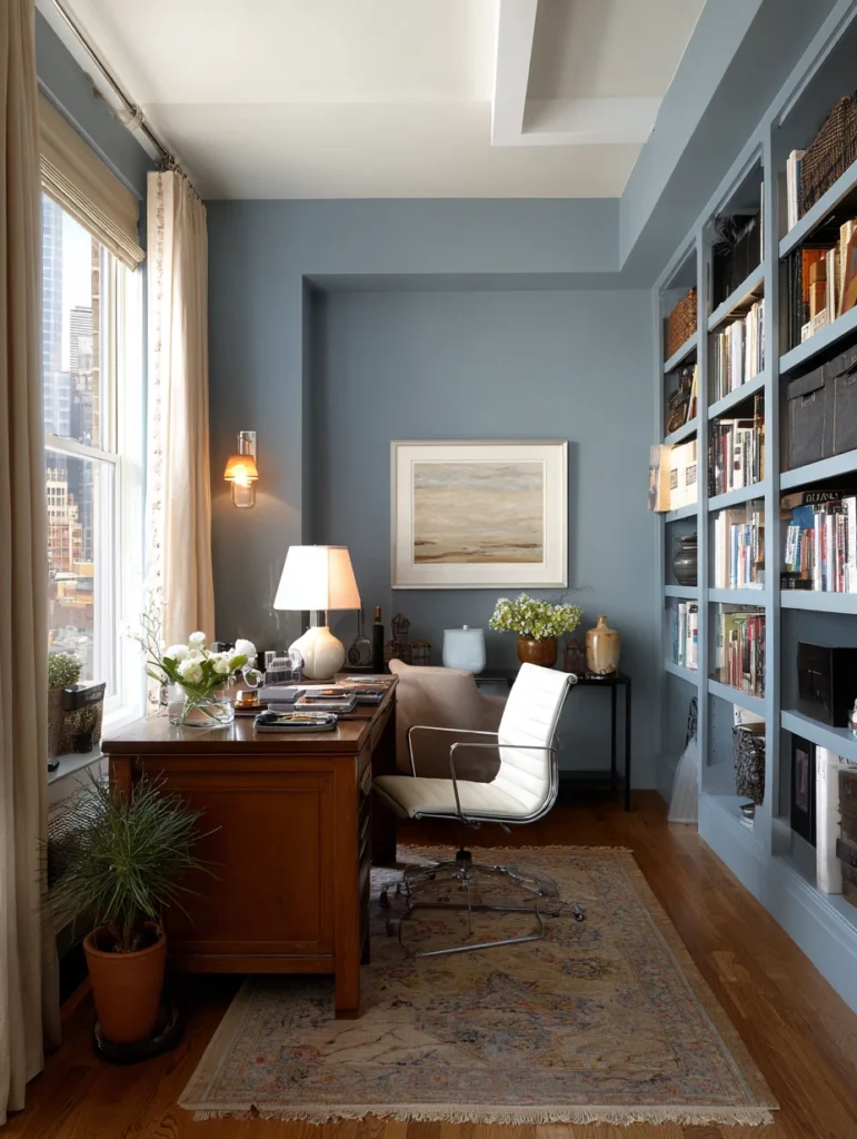
Sophisticated Serenity: Dusty blue offers a softer alternative to navy, creating a calming atmosphere that pairs beautifully with warm taupe. This combination feels sophisticated and grown-up without being stuffy. The blue brings tranquility while the taupe adds earthiness and prevents the space from feeling too cool.
Room Recommendations: This pairing works exceptionally well in bedrooms and home offices where you need to feel both calm and focused. The dusty blue can serve as your feature wall color, with warm taupe on the remaining walls creating a cozy envelope. Both colors are neutral enough to work with various furniture styles and accent colors.
Product Spotlight: The Bates Paint Roller Set with Extension Pole makes reaching those high corners and ceilings effortless when you’re painting larger rooms. The microfiber rollers create smooth, lint-free coverage, essential for achieving a professional look with sophisticated colors like dusty blue and taupe. The extension pole saves your back and eliminates the need for constantly moving a ladder.
Read More: 17 Creative Temporary Door Ideas For the Home
7. Burnt Orange and Deep Teal
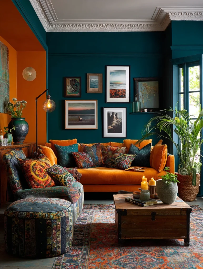
Unexpected Drama: Burnt orange and deep teal might seem like an unlikely pair, but together they create a bold, artistic combination that’s full of personality. The warmth of burnt orange balances the coolness of teal, creating visual interest that’s dynamic without being chaotic. This pairing works for anyone who wants their walls to make a statement.
Making It Work: The trick with this combination is choosing which color takes center stage – teal as the dominant color feels more calming, while burnt orange as the main hue creates energy. Consider using one color on three walls and the other on your accent wall. Both colors have enough depth to stand up to each other without competing.
Product Spotlight: The Shur-Line Premium Paint Edger gives you the precision you need when working with two bold colors that require crisp separation. The edger guide wheels run along trim, ceilings, and corners while the paint pad delivers smooth coverage right up to the edge. You’ll get professional results without the hand cramps from endless brushwork.
Read More: 17 Laundry Room Decor Ideas for a Space You’ll Love
8. Soft Lavender and Light Gray
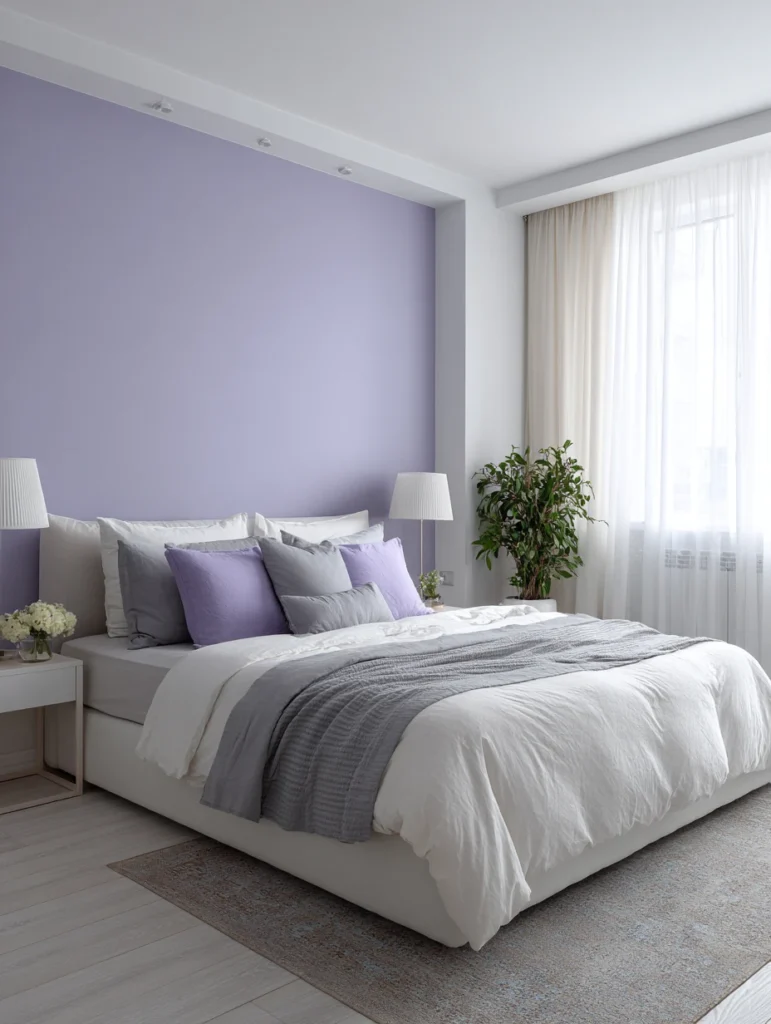
Gentle Elegance: Soft lavender paired with light gray creates a soothing, sophisticated combination. The lavender adds just enough color to keep things interesting, while the gray provides a neutral foundation that feels modern. This pairing never feels heavy or overwhelming, making it perfect for smaller spaces that need to feel open and airy.
Ideal Spaces: Bathrooms and bedrooms benefit most from this calming combination, though it can work beautifully in powder rooms or walk-in closets too. Use light gray as your main color to keep the space feeling spacious, then introduce lavender on one wall or in smaller doses. The subtle contrast creates visual interest without demanding attention.
Product Spotlight: The ScotchBlue Original Multi-Surface Painter’s Tape ensures those delicate lavender and gray sections meet with perfect precision. This tape removes cleanly for up to 14 days after application, which is helpful if your project takes longer than expected. The medium adhesion works on various surfaces without pulling off existing paint when removed.
Read More: 17 Closet Organization Ideas to Maximize Space and Style
9. Burgundy and Warm Beige
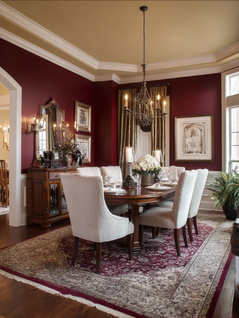
Rich and Refined: Burgundy adds depth and luxury to any space, especially when paired with warm beige, which softens its intensity. This combination feels traditional yet timeless, creating an atmosphere that’s both elegant and comfortable. The burgundy adds drama without being dark, while the beige ensures the room doesn’t feel too heavy.
Best Applications: Dining rooms and libraries are natural fits for this sophisticated pairing, though it can work beautifully in bedrooms too if you want a cocooning effect. Use burgundy sparingly as an accent wall or on lower portions of walls with beige above. The warmth of both colors creates an intimate atmosphere perfect for entertaining or quiet evenings.
Product Spotlight: The HomeRight PaintStick EZ-Twist Paint Roller simplifies painting larger beige sections by holding paint inside the roller handle, eliminating constant trips to the tray. The internal paint reservoir means less mess and faster coverage, especially useful when you’re working with lighter colors like beige that might need multiple coats. The roller refills with a simple twist.
Read More: 17 Genius Jewelry Display Ideas I’m Obsessed About
10. Coral and Soft Mint
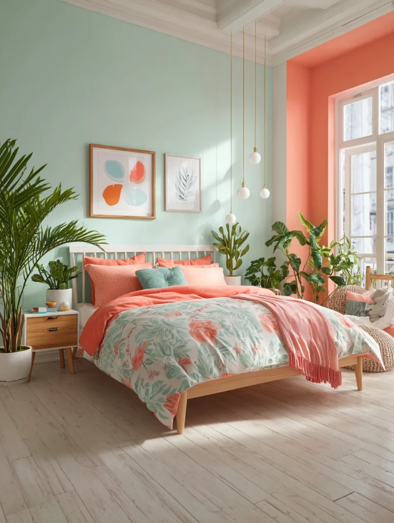
Playful Freshness: Coral and soft mint combine to create an energetic, refreshing look without being overwhelming. The coral brings warmth and personality, while the mint adds a cooling element, preventing the space from feeling too intense. This pairing works particularly well in spaces where you want to feel energized and happy.
Color Distribution: Let mint be your primary color to keep things feeling fresh and open, then use coral as strategic accents on one wall or architectural features. The mint prevents the coral from dominating while still allowing it to shine. Together, they create a balance that’s both fun and long-term livable.
Product Spotlight: The Homax Group Paint Guard Applicator protects your trim, baseboards, and ceilings while you’re rolling on these cheerful colors. The flexible plastic shield adjusts to various angles and surfaces, catching drips and preventing paint from going where it shouldn’t. It’s reusable and washable, making it a smart investment for multi-room projects.
Read More: 17 Rustic Entryway Ideas That Welcome In Style
11. Chocolate Brown and Cream
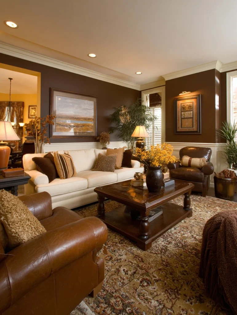
Timeless Warmth: Chocolate brown paired with cream creates a classic combination that feels both luxurious and comforting. The brown adds richness and depth without making the space feel dark, while the cream brings light and prevents the brown from overwhelming. This pairing has serious staying power – you won’t tire of it quickly.
Strategic Use: This combination works beautifully in living rooms, bedrooms, and even kitchens where you want a warm, inviting atmosphere. Consider chocolate brown on the lower portions of walls with cream above, or use brown as an accent wall with cream surrounding it. The contrast creates visual interest while maintaining a cohesive, sophisticated feel.
Product Spotlight: The Purdy Nylox Series Elasco Paint Brush Set handles both your chocolate and cream colors with ease, offering different brush sizes for various tasks. The nylon and polyester blend works perfectly with latex paints, maintaining stiffness for control while still holding plenty of paint. These brushes clean up easily and last through multiple projects.
Read More: 17 Pantry Organization Ideas to Whip Your Space Into Shape
12. Peacock Blue and Gold
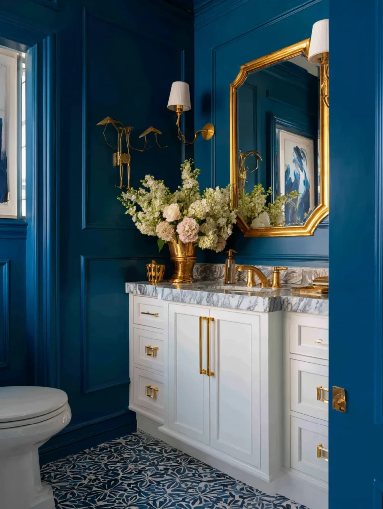
Glamorous Statement: Peacock blue paired with gold creates a combination that’s undeniably luxurious and dramatic. The rich blue provides a stunning backdrop that makes gold accents absolutely sing. This pairing isn’t for the timid – it makes a bold statement that transforms ordinary rooms into showstoppers.
Implementation Strategy: Peacock blue works best as your dominant color, covering most walls while gold appears in smaller doses through painted trim, stenciled details, or a single accent wall. Too much gold can feel overwhelming, but the right amount creates that perfect touch of glamour. This combination particularly shines in powder rooms, dining rooms, or entryways where you want immediate impact.
Product Spotlight: The Duck Brand Clean Release Painter’s Tape is crucial when you’re working with metallic gold paint that needs crisp edges against peacock blue. This tape features edge-lock technology that prevents paint bleed and removes cleanly for up to 60 days after application. The clean removal is especially important with metallic paints that can be trickier than standard finishes.
Read More: 17 Genius Blanket Storage Ideas
13. Mustard Yellow and Charcoal
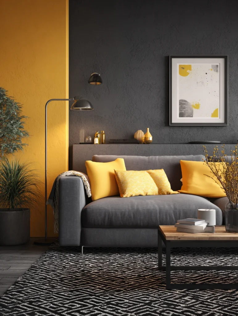
Modern Edge: Mustard yellow brings warmth and energy, while charcoal provides the perfect grounding element for this modern pairing. The combination feels current and sophisticated, offering a contemporary twist on traditional yellow and gray. The mustard is bold enough to make a statement but earthy enough to feel livable.
Proportion Matters: Charcoal should dominate this pairing to prevent the mustard from overwhelming your space – think three charcoal walls with one mustard accent, or charcoal as your base with mustard in strategic spots. The dark gray makes the yellow pop without making it feel too bright or childish. This works wonderfully in modern living spaces and home offices.
Product Spotlight: The Wooster Brush Roller Cover delivers smooth, professional coverage that’s essential when working with bold colors like mustard yellow. The woven fabric creates a lint-free finish with no roller marks, even on challenging colors. These covers hold more paint than cheaper alternatives, meaning fewer reloads and faster project completion.
Read More: 17 Gorgeous Backyard Ideas for a Small Backyard or Patio
14. Mauve and Gray-Green
Subtle Sophistication: Mauve paired with gray-green creates an understated combination that’s quietly elegant. Both colors have muted qualities that work together harmoniously without competing for attention. This pairing feels grown-up and refined, perfect for creating calm, sophisticated spaces that never feel boring.
Where to Use It: Bedrooms benefit most from this calming combination, though it works beautifully in bathrooms and dressing areas too. The gray-green can serve as your main color with mauve accents, or you can flip it to emphasize cooler or warmer undertones. Either way, you’ll create a serene atmosphere that promotes relaxation.
Product Spotlight: The Wagner Spraytech Home Decor Paint Sprayer makes applying these subtle colors quick and professional-looking, especially useful for larger rooms or multiple spaces. The adjustable settings let you control spray pattern and paint flow, creating smooth, even coverage without brush marks. It’s particularly helpful with colors like mauve that can show streaks with traditional roller application.
Read More: Creative Fruit Tray Ideas You’ll Actually Want to Make
15. Brick Red and Cream
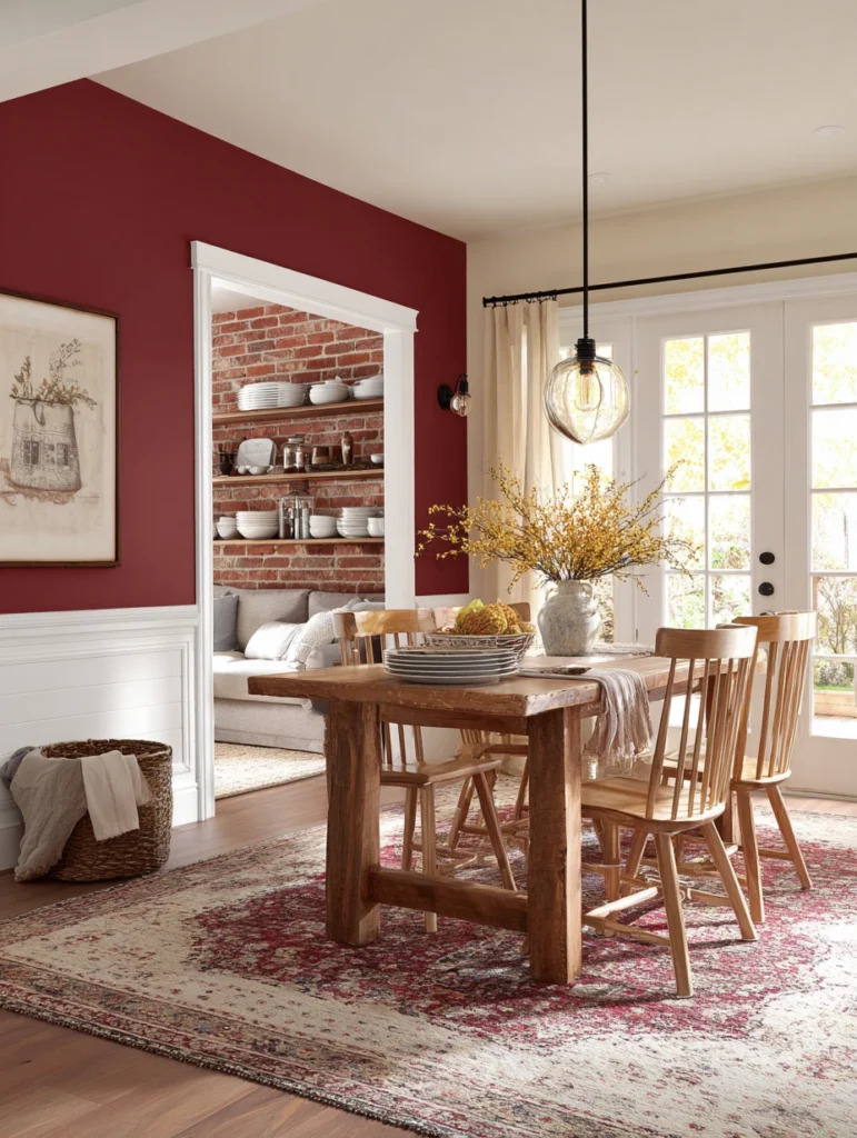
Rustic Charm: Brick red paired with cream creates a warm, inviting, slightly rustic combination without feeling country-kitsch. The brick red adds character and coziness, while the cream keeps things from feeling too heavy or dark. This pairing has a timeless quality that works in both traditional and transitional spaces.
Application Ideas: This combination shines in dining rooms, kitchens, and family rooms where you gather with loved ones. Use brick red on accent walls to create focal points, with cream on surrounding walls to balance the intensity. The warmth of both colors creates an atmosphere that’s naturally welcoming and comfortable.
Product Spotlight: The Graco Magnum Project Painter Plus Paint Sprayer tackles larger projects efficiently when you’re painting multiple rooms in these warm tones. The powerful motor handles thick latex paints without thinning, while the stainless steel piston pump delivers consistent pressure for professional results. You’ll finish your painting project in a fraction of the time traditional methods require.
Read More: 17 DIY Entryway Makeover Ideas to Transform Your Home
16. Slate Blue and Soft White
Cool Serenity: Slate blue offers a sophisticated alternative to brighter blues, creating a calming atmosphere when paired with soft white. This combination feels clean and fresh without being cold, offering tranquility that’s perfect for busy households. The slate blue provides color interest while the soft white keeps everything feeling light and airy.
Perfect Pairings: Bedrooms, bathrooms, and home offices all benefit from this peaceful combination that promotes focus and relaxation. Slate blue works beautifully as your feature wall color, with soft white on the remaining walls creating an envelope of calm. The subtle contrast is enough to create interest without demanding attention.
Product Spotlight: The Bates Choice Paint Brush Set includes various brush sizes perfect for both your slate blue accents and soft white base coats. The synthetic bristles work smoothly with latex paints, creating streak-free coverage that looks professionally done. The comfortable grip handles reduce hand fatigue during longer painting sessions.
17. Olive Green and Rust
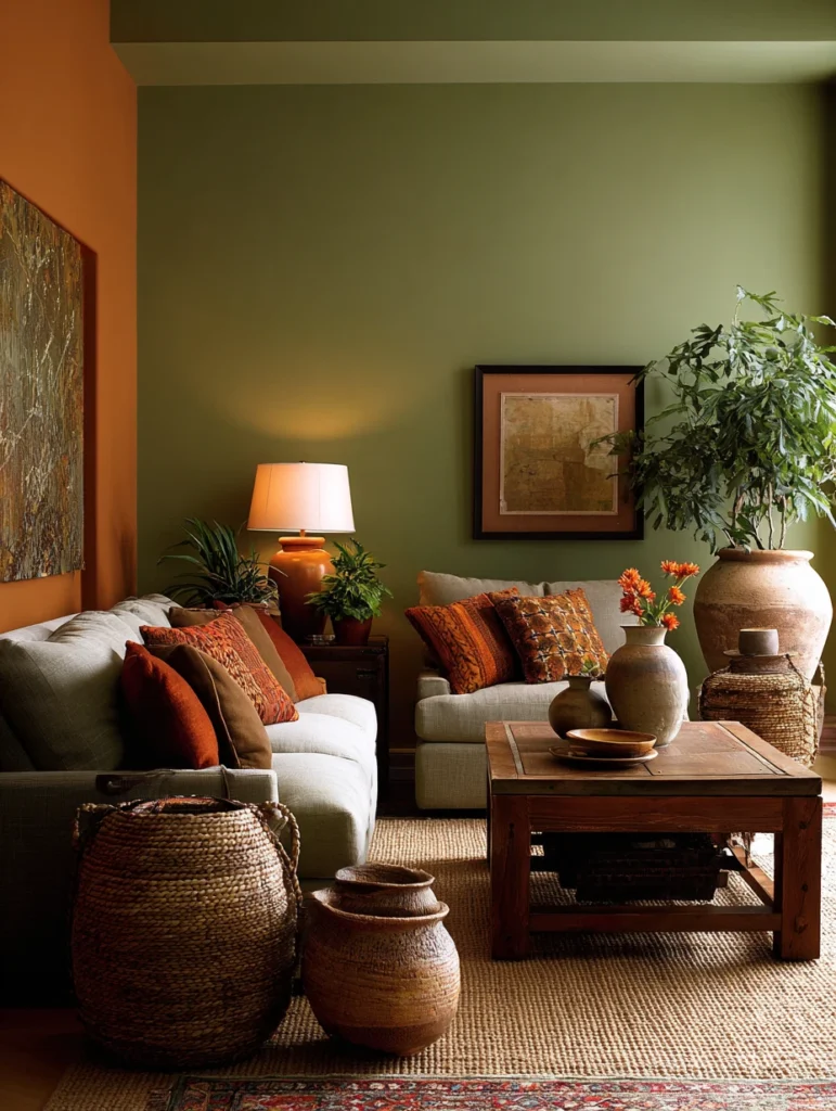
Earthy Elegance: Olive green paired with rust creates a deeply grounded, nature-inspired combination. Both colors have earthy qualities that work together to create warmth without being overwhelming. This pairing feels organic and lived-in, perfect for creating spaces that feel collected over time rather than decorated all at once.
Styling Strategy: Living rooms and bedrooms embrace this combination beautifully, creating cozy retreats that feel connected to nature. Olive can serve as your dominant color with rust accents, or use them equally if you’re feeling bold. Both colors have enough depth to create interest while remaining neutral enough to work with various furniture styles.
Product Spotlight: The Paint Runner Pro Roller Brush Handle Tool speeds up your painting process with these rich, earthy tones that sometimes require multiple coats. The extended handle eliminates bending and stretching, while the roller covers walls quickly and evenly. The paint flows directly from the handle to the roller, reducing mess and making touch-ups easier.
18. Pale Aqua and White
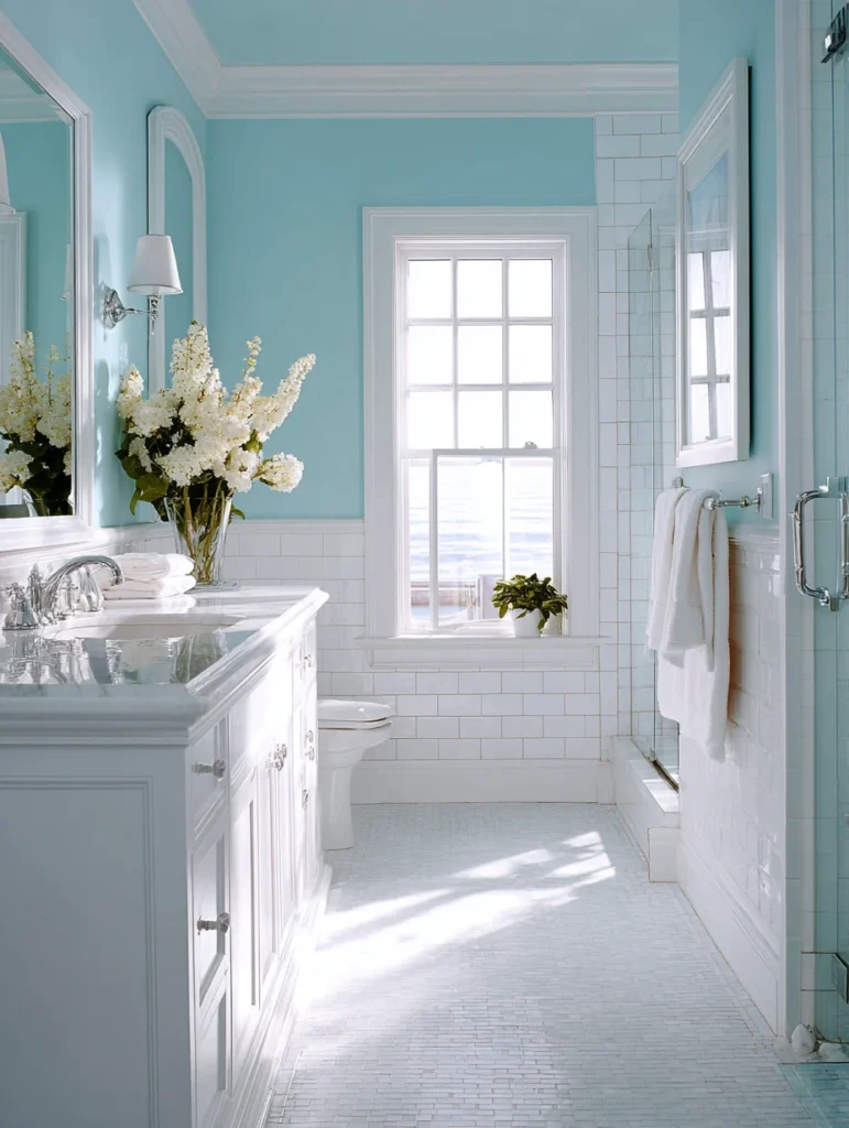
Coastal Calm: Pale aqua brings beach-house vibes without being literal or themed, especially when paired with crisp white. This combination feels fresh, clean, and naturally calming. The aqua adds just enough color to create interest, while the white amplifies light and keeps everything feeling open and breezy.
Ideal Settings: Bathrooms are naturals for this combination, but it works equally well in bedrooms, kitchens, and even living areas where you want a light, airy feel. Let white dominate with pale aqua as accents, or reverse it in smaller spaces that can handle more color. The combination never feels heavy or dark.
Product Spotlight: The Mr. LongArm Multi-Purpose Extension Pole extends your reach when painting ceilings and upper walls in these light colors that show every imperfection. The pole adjusts from 4 to 8 feet, eliminating the need for constant ladder repositioning. The threaded tip works with most roller handles and painting tools for versatile use throughout your project.
19. Deep Plum and Champagne
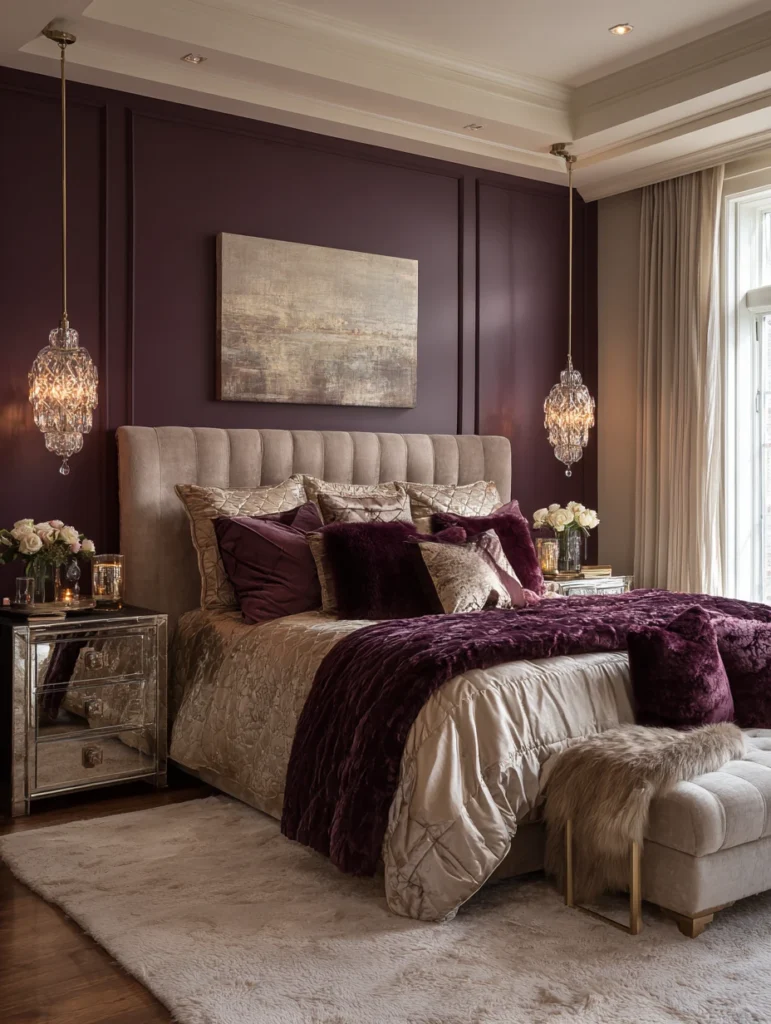
Luxurious Drama: Deep plum creates instant drama and sophistication, especially when balanced with champagne’s subtle shimmer and warmth. This combination feels luxurious and intentional, transforming ordinary rooms into special spaces. The plum provides richness while the champagne adds light without being stark white.
Best Locations: This pairing works wonderfully in bedrooms where you want a cocooning effect, or dining rooms where you entertain and want to impress. Use deep plum sparingly as an accent to prevent overwhelming the space, with champagne on the remaining walls. The contrast creates depth and interest while maintaining sophistication.
Product Spotlight: The Purdy XL Series Sprig Paint Roller Cover handles both deep plums and lighter champagnes with professional results. The angular fibers create smooth, uniform coverage without stippling or texture marks. This roller cover works particularly well with rich, deep colors that can sometimes show application marks with lower-quality rollers.
20. Tangerine and White
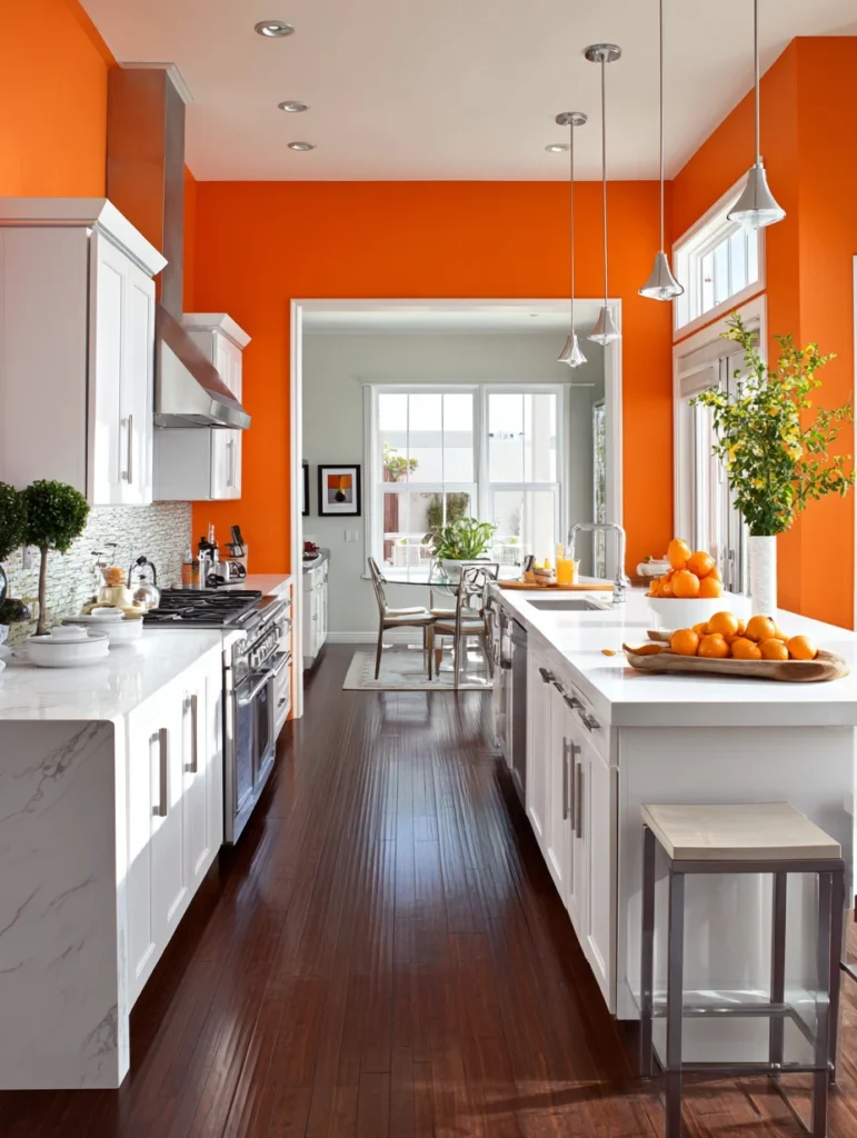
Energetic Simplicity: Tangerine brings serious energy and personality to any space, while white provides the perfect neutral backdrop that lets the orange shine. This combination is cheerful and bold without being childish. The white prevents the tangerine from overwhelming, creating a balance that’s both dynamic and livable.
Smart Application: Tangerine works best as a strategic accent – one wall, a hallway, or an alcove – with white dominating the remaining space. Too much tangerine can feel intense, but the right amount creates a focal point that energizes without exhausting. This combination particularly shines in kitchens, home gyms, or creative spaces where you want to feel inspired.
Product Spotlight: The Rubbermaid Commercial Products Paint Bucket keeps your tangerine and white paints organized and easily accessible during your project. The sturdy handle and pouring spout prevent spills and drips, and the durable construction lets you reuse it for future projects. The graduated interior measurements help you mix custom colors to match existing paint.
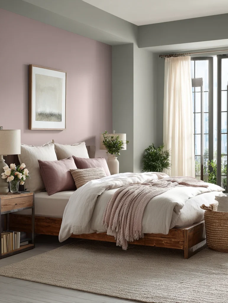
21. Pewter Gray and Soft Blush
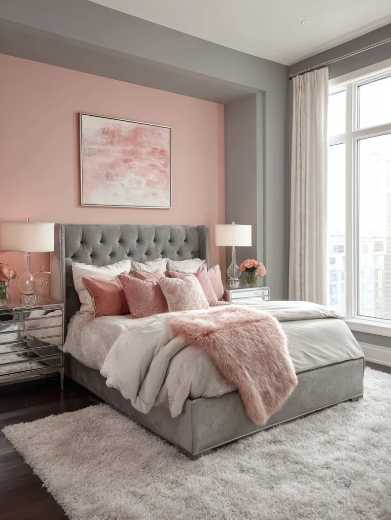
Modern Softness: Pewter gray offers a sophisticated neutral that becomes romantic when paired with soft blush. This combination feels current and grown-up, offering warmth without being overtly feminine. The gray provides structure while the blush adds softness, creating a balance that’s both calming and interesting.
Final Thoughts on Placement: Bedrooms and powder rooms are perfect for this gentle combination, though it works beautifully in living areas too if you prefer subtle color palettes. Pewter can serve as your dominant color with blush accents, or use them more equally if you want warmth to dominate. Either approach creates a space that feels sophisticated and inviting.
Product Spotlight: The Whizz Premium Silver Stripe Roller Covers deliver professional-quality results with both pewter and blush tones. The white woven fabric creates an ultra-smooth finish, essential for showcasing these subtle colors at their best. These roller covers shed minimal lint and hold their shape through multiple uses, making them worth the slightly higher investment.
Final Thoughts
There you have it – 21 stunning color combinations that prove you don’t need to play it safe with all-white walls. Whether you’re drawn to bold and dramatic pairings or prefer soft and subtle combinations, there’s something here for every style and personality. The key is choosing colors that make you feel good when you walk into a room.
And remember, paint isn’t permanent – if you don’t love it, you can always change it. Now grab those brushes and start transforming your space into something that feels uniquely yours!